17 Dining Room Wall Decor Ideas, Wall by Wall
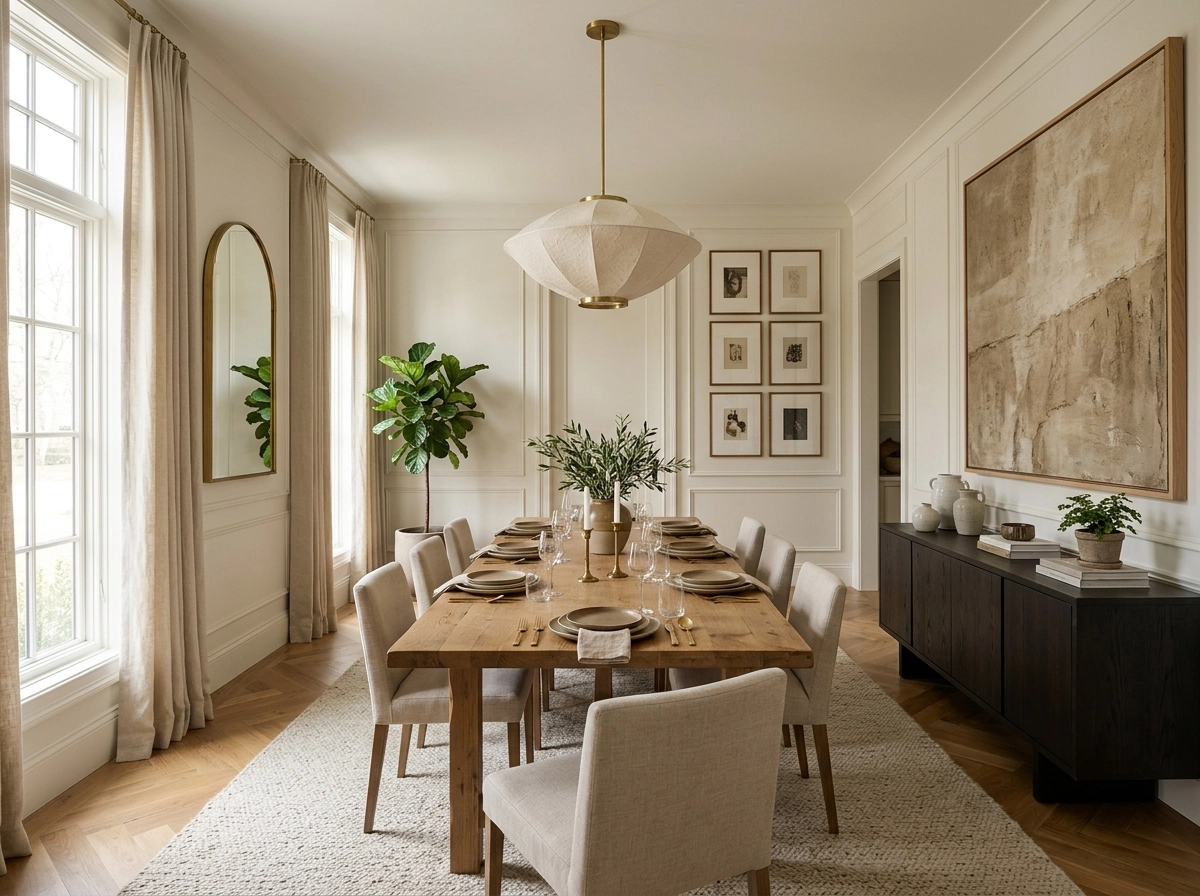
Dining room walls are hard to decorate as a set because they are not a set. One wall is mostly window, one has the door swinging through it, one is the big blank expanse everyone stares at over dinner, and in an open plan room the fourth wall does not exist at all. Advice that treats them as four copies of the same wall produces the usual result: one gallery wall, three apologies.
So this list goes wall by wall. Find your room’s big wall, window wall, narrow wall and open side below, and take the ideas that fit each one. A finished dining room rarely uses more than one idea per wall, chosen for what that wall can actually hold.
The Big Wall
This is the long, uninterrupted wall, usually behind or facing the sideboard, and it carries the room’s whole look. It can take the largest gestures you own.
1. Hang one oversized piece of art
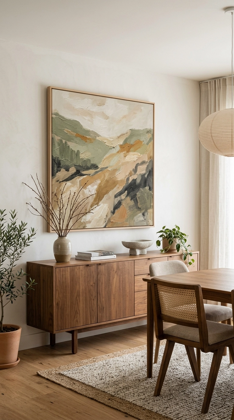
A single large painting or print, roughly two thirds the width of the sideboard or table beneath it, settles a big wall in one decision. In dining rooms it beats a cluster, because people sit facing it for an hour at a time and calm wins.
Scale test: if you can see all four edges of the frame at once from your seat without moving your eyes, it is probably too small for this wall.
2. Build a grid gallery of matching frames
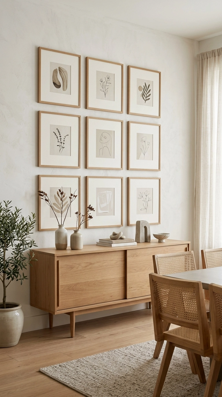
When one big piece is out of budget, a strict grid of six to nine matching frames reads as one large artwork from across the room. The sameness of the frames is what makes it work, the images inside can be anything from botanical prints to family photos in black and white.
Grid maths: identical frames, identical gaps of 5 to 7 cm, hung as one block. Measure the whole block, mark its corners, then hang.
3. Hang a plate wall
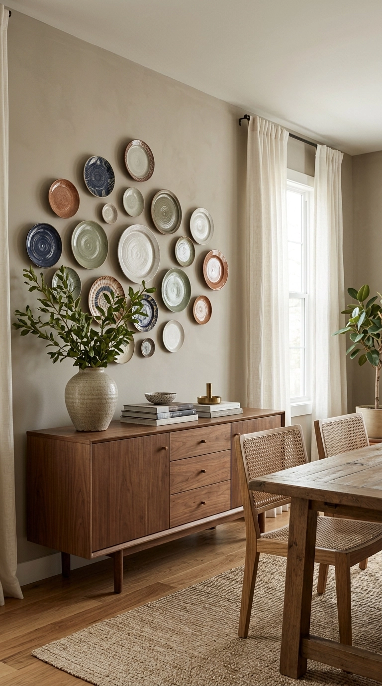
Decorative plates, platters and shallow baskets arranged over a sideboard are the dining room’s own traditional decor, and they bring pattern and circles into a room full of rectangles. Charity shops and family cupboards are the usual sources, which makes this the cheapest big wall in the house to finish.
Hanging hardware: spring plate hangers grip the rim and hide behind the plate. Plate rails wobble, hangers do not.
4. Lean the wall on a large mirror
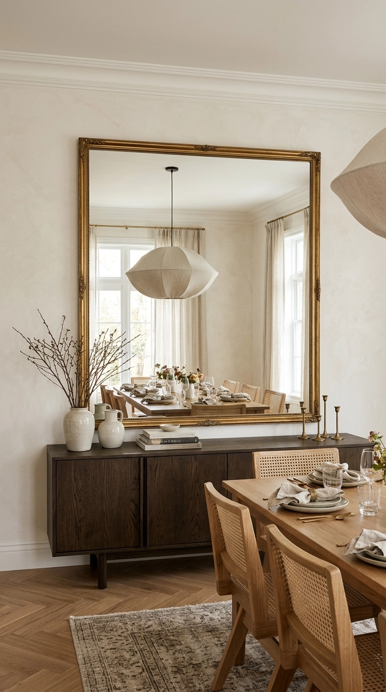
A big mirror on the big wall doubles the light from the window wall opposite and reflects the table setting, the pendant light and the people, which is the whole point of the room. Choose a frame with some presence, thin frameless mirrors read as bathroom stock at this size.
Reflection check: sit in every chair before fixing it. A mirror that reflects the kitchen counter chaos has decorated the wrong view.
The hanging-height formula
Eye level centre: the centre of any piece or arrangement sits about 145 cm from the floor, the average standing eye level used by galleries.
Above furniture: the bottom of the frame hangs 15 to 20 cm above a sideboard or console surface, close enough to read as one group, far enough to clear tall serving pieces.
Above the table zone: nothing hangs low over the table itself. The pendant light owns that space.
Grids and groups: treat the whole arrangement as one picture and apply the 145 cm rule to its centre, not to each frame.
The Window Wall
This wall is mostly glass, so its decor is framing and edges rather than hanging things in the middle.
5. Treat the curtains as the wall decor
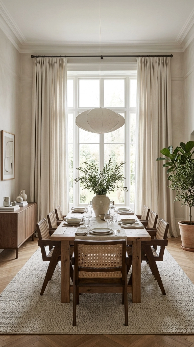
Full height curtains in a colour or weave with real presence turn the window wall into the room’s soft feature and absorb the echo that makes dining rooms feel hard. Hang them wider than the window so the fabric frames the glass even when open.
Echo note: one soft surface in a dining room, curtains, a rug or upholstered chairs, is the difference between dinner party hum and canteen clatter.
6. Use a patterned Roman blind as the picture
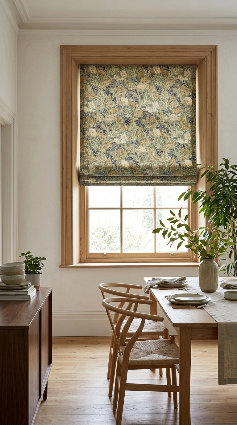
Where full curtains overwhelm a small room, a Roman blind in a patterned or trimmed fabric sits inside the window like a framed textile picture. It is the one window treatment that counts as wall decor in its own right.
Pattern scale: on a blind the pattern repeats over a small drop, so medium scale prints survive the folds. Tiny prints disappear into stripes when the blind is raised.
7. Hang a wreath or garland in the glass
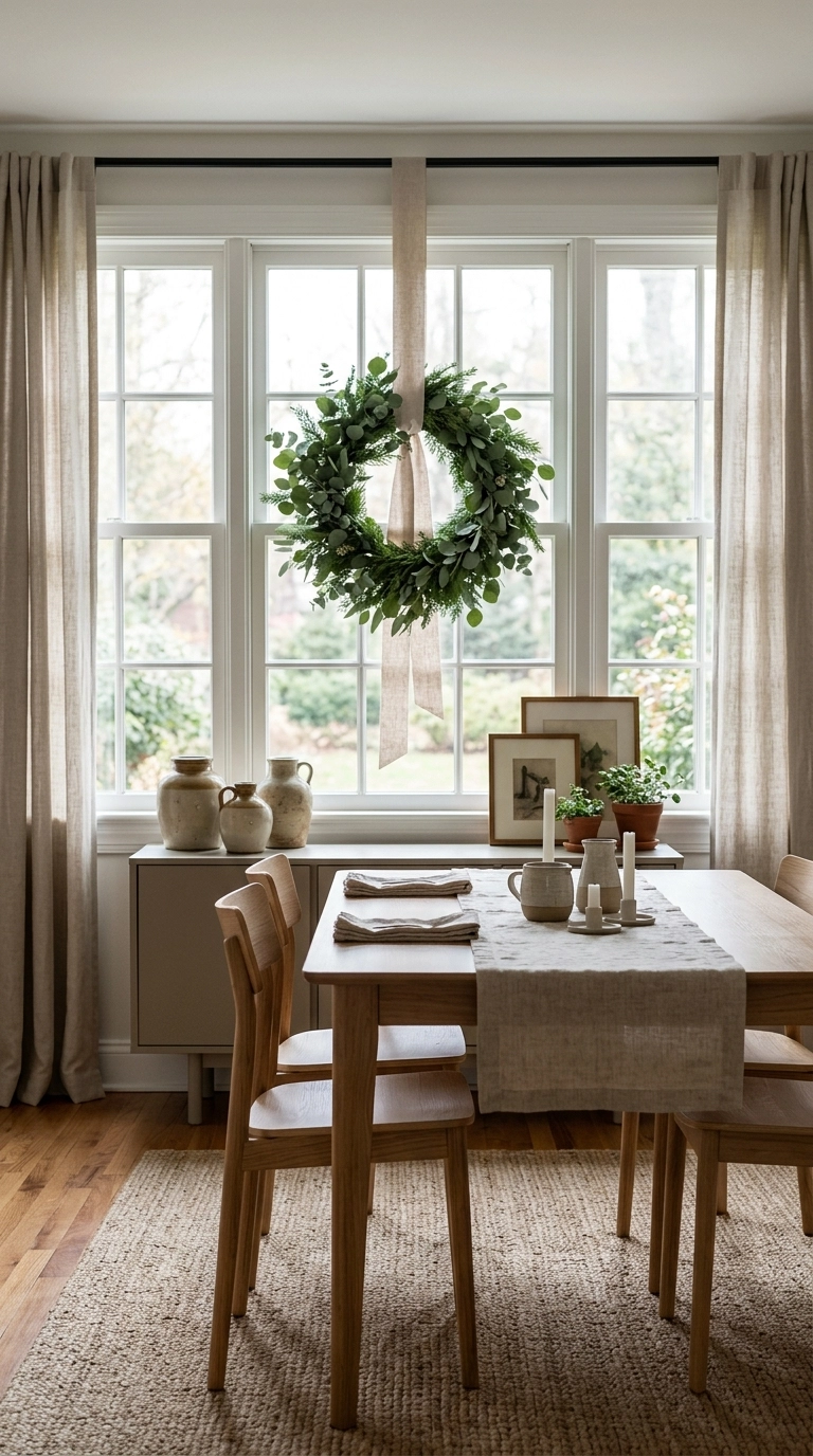
A wreath hung in the centre of the window on a ribbon from the top of the frame decorates the glass itself and changes with the seasons. It is the fastest refresh in this whole list and costs almost nothing beyond the wreath.
Ribbon trick: hang it from a small hook on top of the frame, not a suction cup on the glass, and it will never slide down mid dinner.
The Narrow Wall
The strip of wall between a door and a corner, or between two windows, is too narrow for standard pieces and usually gets left blank, which makes it look narrower.
8. Stack two prints vertically
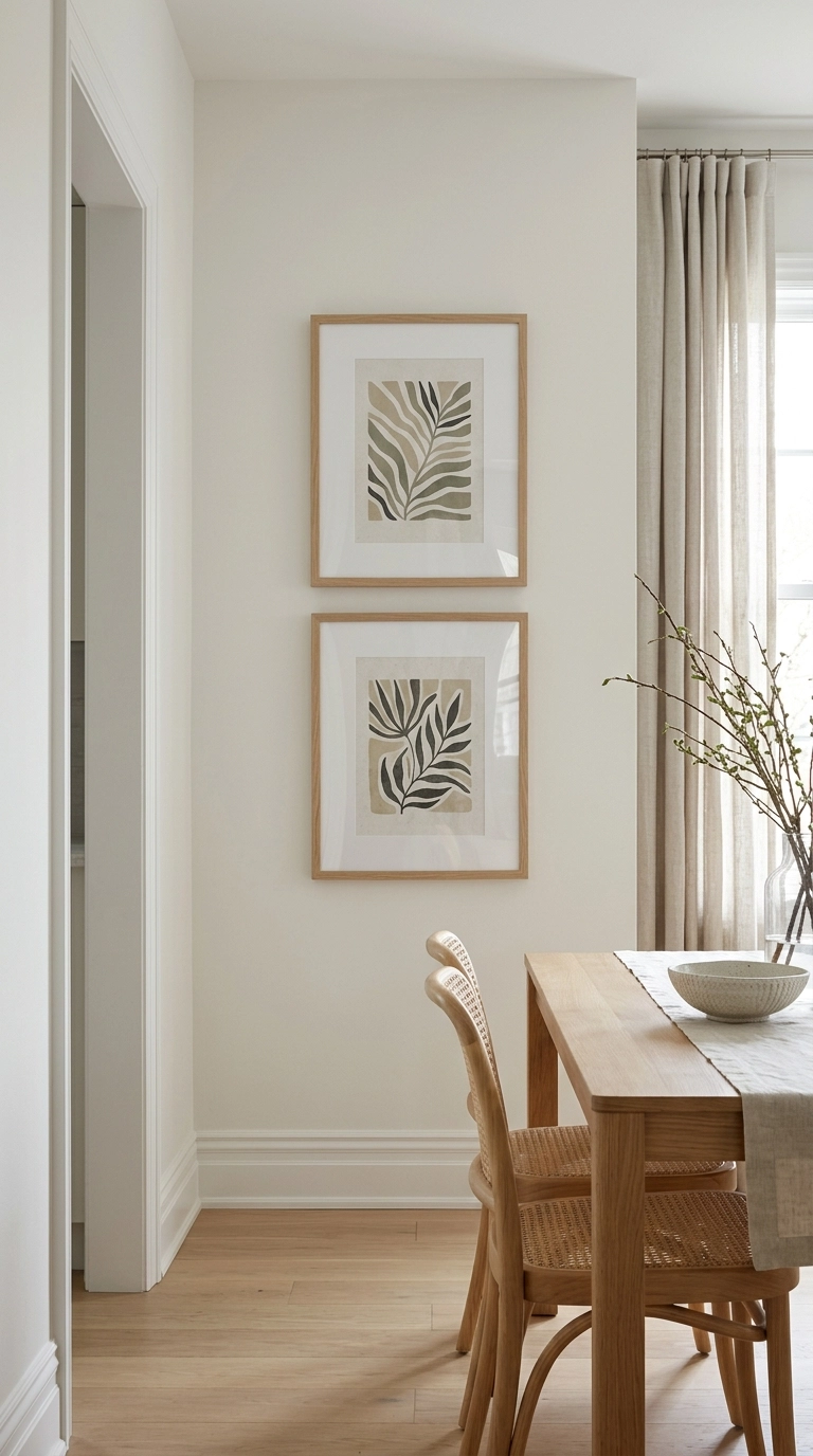
Two matching prints hung one above the other use a narrow wall’s height instead of fighting its width. The pair reads as one tall piece and pulls the eye up, which makes the ceiling feel higher from the table.
Pairing rule: same frame, same mount, related images. A vertical stack only works when the two pieces clearly belong together.
9. Fit slim shelves and style them sparsely

Two narrow shelves, 12 to 15 cm deep, hold ceramics, candlesticks and a small stack of cookbooks without projecting into the room’s circulation. On a narrow wall, shallow and styled beats deep and useful.
Depth discipline: nothing on these shelves should be wider than the shelf. The moment pieces overhang, the wall looks like storage again.
10. Hang one tall textile
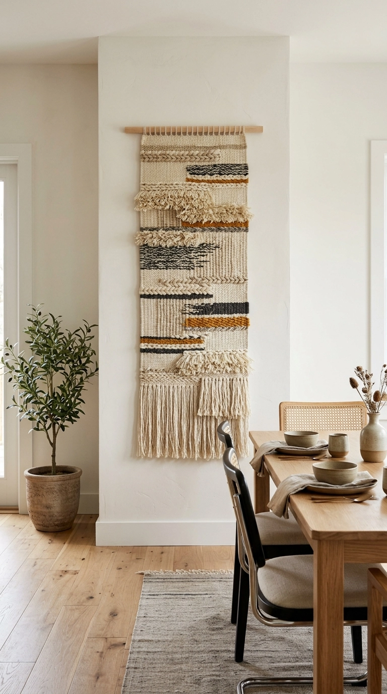
A woven hanging, a narrow tapestry or even a beautiful table runner mounted on a rod gives a narrow wall softness and height in one piece, and it weighs almost nothing, so one picture hook holds it.
Dining logic: textiles near food should be washable or far from splash range. Hang textiles on the narrow wall away from serving traffic.
Myth vs fact: dining wall edition
Myth: wall art in a dining room should match the curtains or chairs.
Fact: art needs to suit the wall’s size and the room’s light. Matching everything to the fabric is how rooms end up looking like a furniture showroom set.
Myth: small dining rooms need small pictures.
Fact: small rooms need fewer, larger pieces. One generous piece calms a small wall, six small frames make it busier and smaller.
Myth: gallery walls must use identical frames.
Fact: identical frames suit a strict grid. A salon style gallery can mix frames freely, what it cannot mix is spacing logic. One system, applied consistently, is what reads as intentional.
Myth: the wall behind the table should be the feature wall.
Fact: the feature wall is the one diners face, which is usually the wall opposite the most used seats, not automatically the one behind the table.
The Open-Plan Side
Where the dining area opens into the living space, there may be no wall to decorate at all. The job passes to the furniture line and to paint.
11. Style the sideboard like a wall
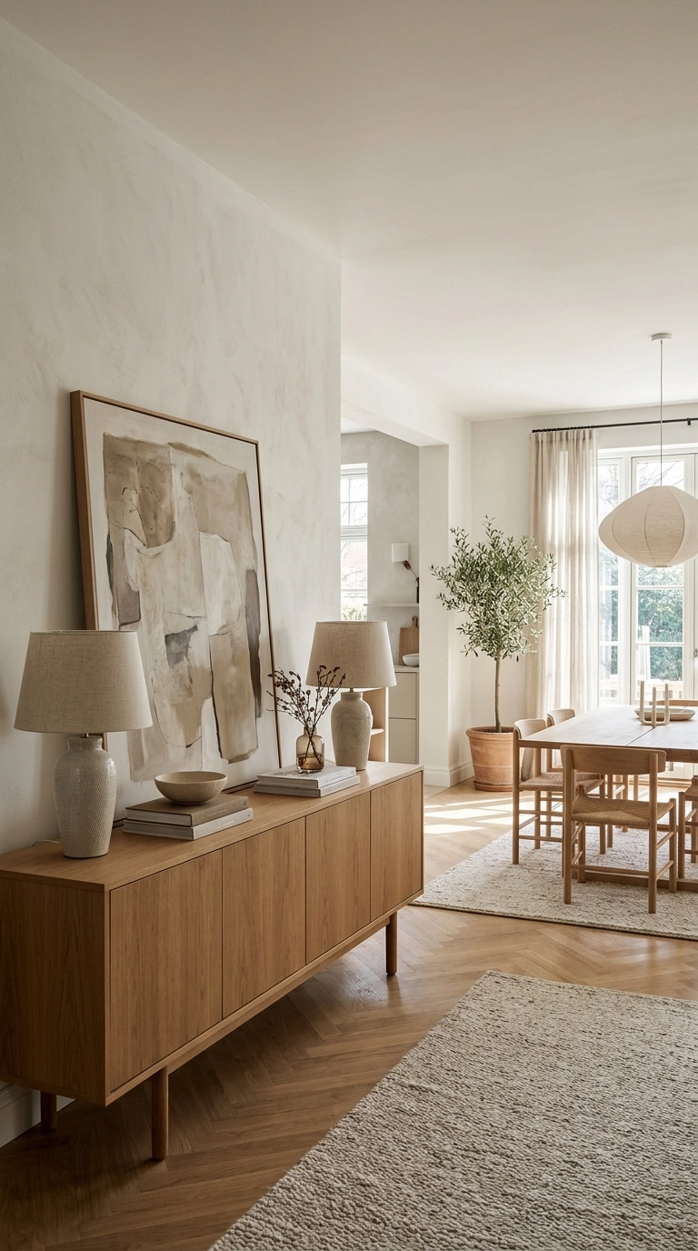
A pair of lamps, one large piece of art leaned against the wall and a stack of books on a sideboard creates the visual anchor a missing wall cannot. In open plan rooms this arrangement is what tells you where dining starts.
Lean, do not hang: leaning the art keeps the arrangement changeable, which open plan rooms need as the zones shift around.
12. Paint a colour block behind the dining zone
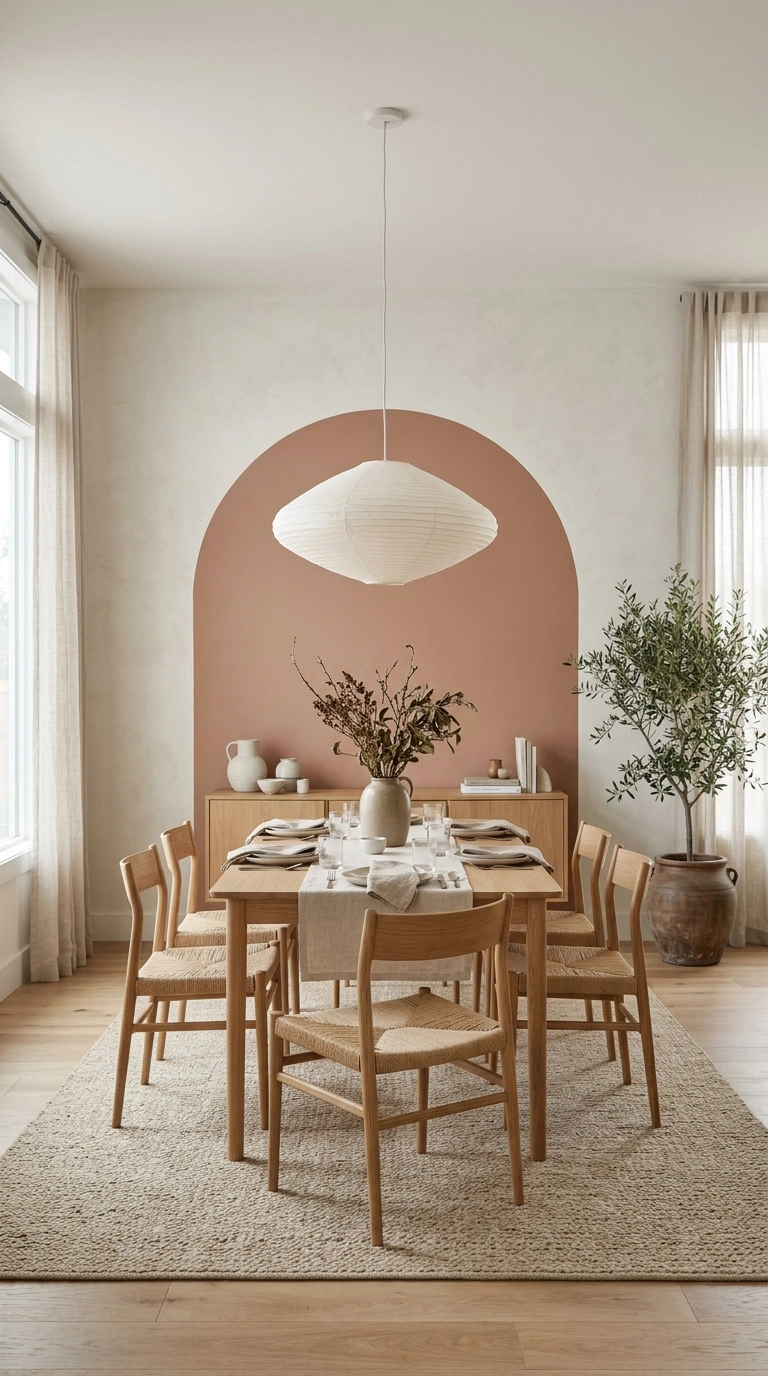
A painted rectangle or arch on the living room wall behind the table, in a tone deeper than the walls around it, draws a wall where none exists and gives the dining zone its own backdrop. It is the cheapest architectural feature you will ever add.
Sizing: the block should extend at least 30 cm beyond the table and sideboard on each side, or it looks like a mistake rather than a feature.
13. Add picture frame moulding to the plain wall
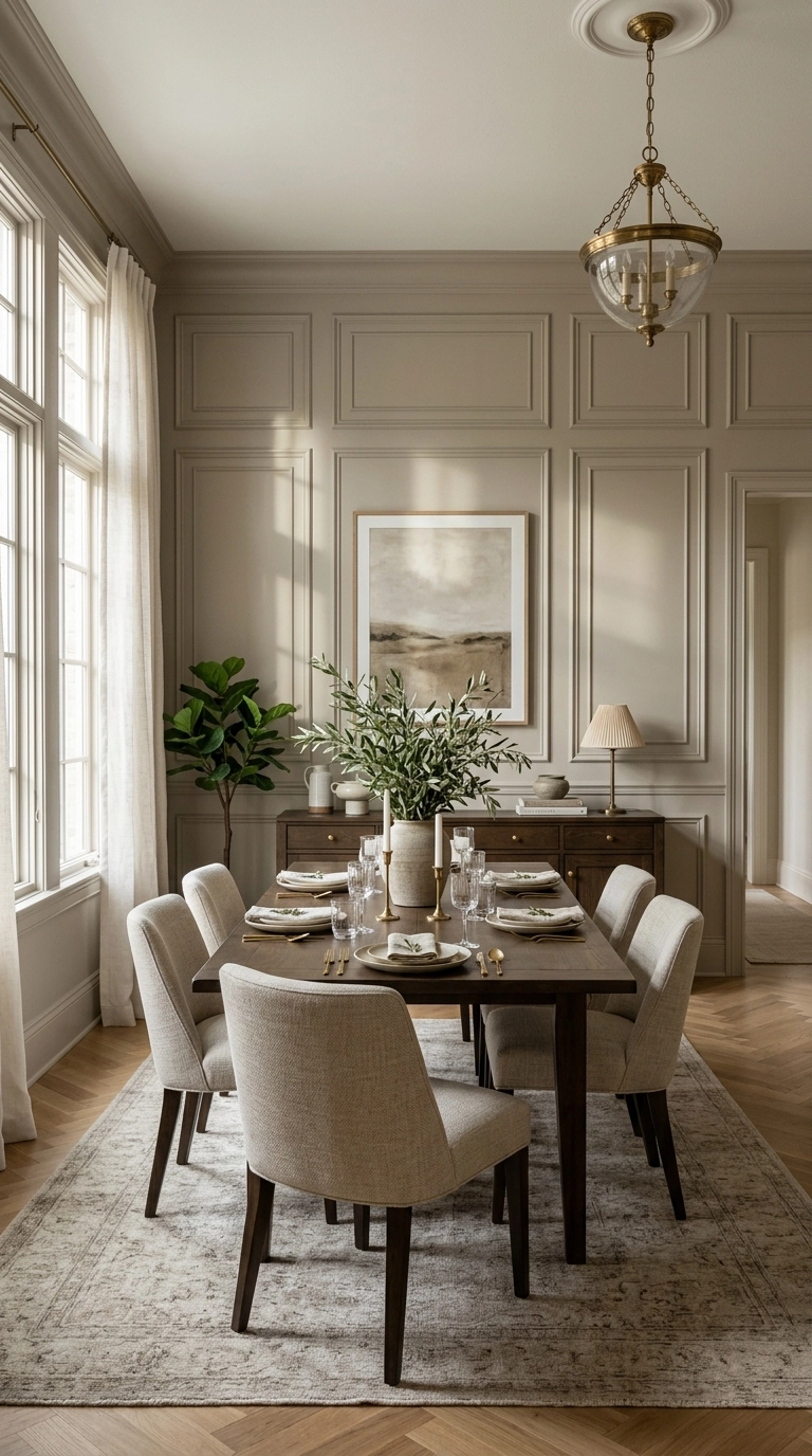
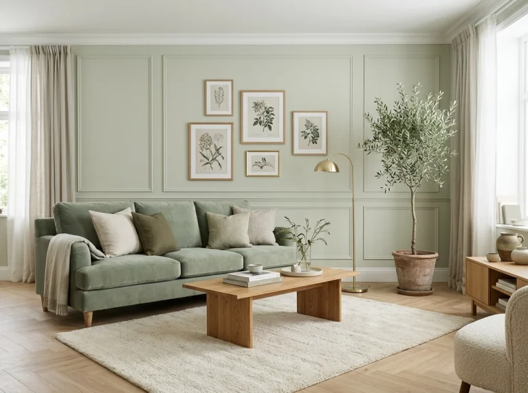
Applied trim in rectangles, painted the same colour as the wall, gives a blank dining wall architecture and shadow lines without a single picture. It suits traditional rooms especially, and art or a mirror can still hang inside the panels later.
Same colour is the point: contrasting trim looks like a mistake in most rooms. The effect comes from shadow, not contrast.
Any Wall, When It Is Nearly Right
14. Fit a picture ledge for rotating art
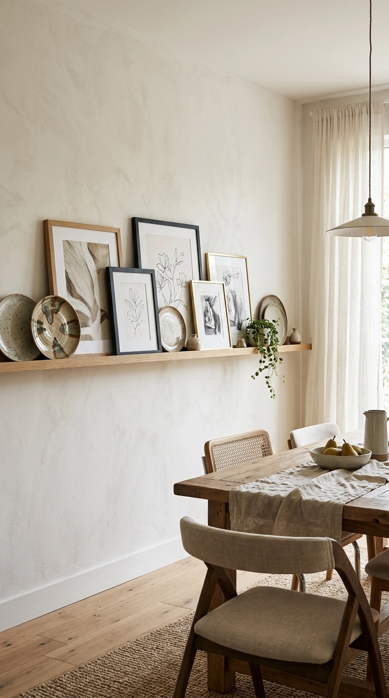
A slim ledge lets you lean and swap prints, plates and small canvases without new holes, so the dining room can change with seasons and occasions. It suits indecisive decorators and rented rooms equally.
Ledge depth: 8 to 10 cm holds frames and small plates. Anything you lean should overlap its neighbour slightly, which stops the row looking like a queue.
15. Let a clock be the anchor
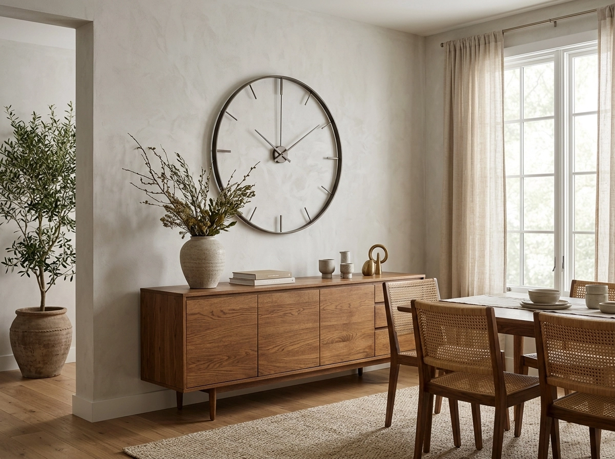
An oversized clock is wall decor that earns its place in a room ruled by cooking times and guests arriving. On a kitchen facing wall or above a sideboard it does the visual work of a large picture with none of the choosing anxiety.
Size honesty: a clock under 40 cm across is a kitchen clock. The dining room version starts at 50 cm and goes up from there.
16. Cluster woven baskets as a relief wall
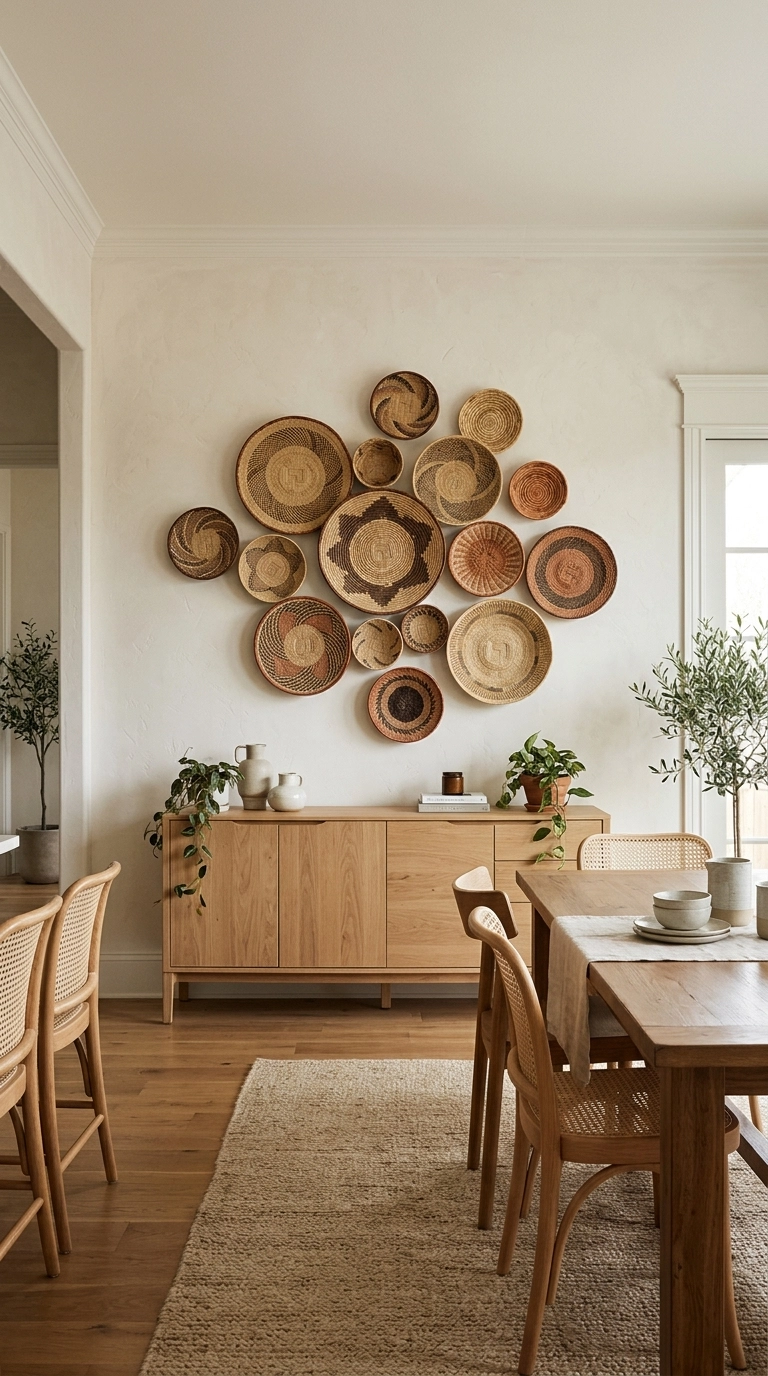
A group of flat woven baskets in mixed sizes brings texture, warmth and pattern to a wall that paint and prints have left cold. They are light, cheap to post, and hang on single pins.
Arrangement: lay the cluster out on the table first, largest basket off centre, smallest filling the gaps, and photograph it before a single pin goes in.
17. Keep one hook rail for the seasons

A simple rail or row of hooks on the least seen wall holds the rotating cast: wreaths at winter, a garland for birthdays, dried flowers in autumn. The wall stays simple all year and festive on demand without storing decor on it permanently.
Storage pairing: this only works if the off season pieces have a labelled box elsewhere. A hook rail is a display system, not a storage system.
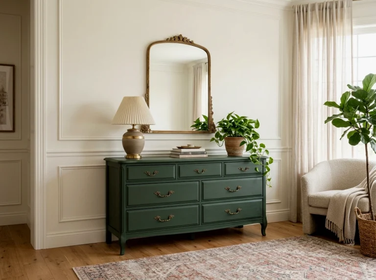
Count your walls before you buy anything. Most dining rooms need one decision for the big wall, an edge treatment for the window wall, one tall gesture on the narrow wall and a painted or styled line where the fourth wall should be. Four decisions, one per wall, and the room is done. For the colour side of the room, sage green living room ideas show how one anchor colour settles a space, and a painted dresser makeover makes a one of a kind sideboard.