25 Blue and Orange Living Room Ideas, Matched by Mood
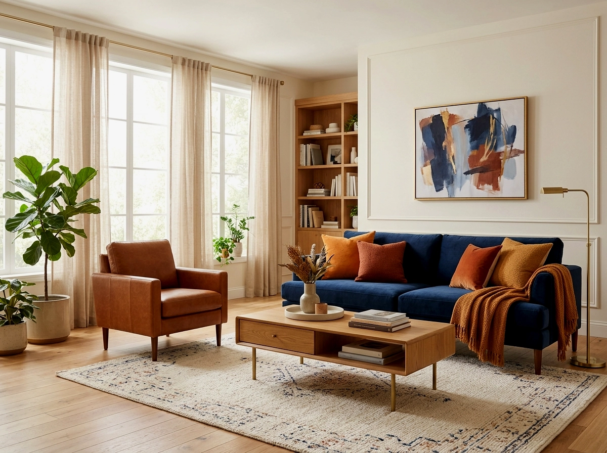
Blue and orange sit opposite each other on the colour wheel, which is exactly why they are so easy to get right and so easy to get wrong. Together they can be gentle as sea glass or loud as a brass band, and the difference is rarely the colours themselves. It is the mood you commit to before you ever name a shade. Decide the feeling first, calm, bold or earthy, and every choice after that, walls, cushions, wood tones, becomes surprisingly simple.
The 60-30-10 Rule
The 60-30-10 rule for opposites: hand blue roughly 60 percent of the room, a supporting colour or neutral 30, and reserve the loudest orange for just 10 percent, at cushion and object scale where it can glow without taking over. In the calm mood the 60 is pale blue washed across walls and big pieces, softened further by white. In the bold mood the 60 flips deeper, navy or cobalt doing the heavy lifting while true orange strikes in short, confident bursts. In the earthy mood the 60 becomes warm neutral, bone, sand and wood, with indigo blue at 30 and clay orange arriving as the final, grounded accent.
Calm Coastal: Pale Blue, White, Soft Apricot
Everything in this mood moves a little slower. The blues are washed out by sun and salt air, the whites are soft rather than clinical, and orange never raises its voice above apricot, peach or the faintest coral. Think of a beach house in the early morning, before anyone is awake, when the whole place seems to breathe quietly. If your living room is where you come to lower your shoulders, start here and let the colour whisper.
1. Pale blue walls, white sofa, apricot cushions

Walls in a powdery, misted blue set the temperature for the whole room, cool and unhurried, while a white sofa keeps the centre of the space feeling open and clean. Against that quiet background, cushions in soft apricot do the gentle work of warmth, warming the blue the way late light warms the sea. Keep the apricot in natural fabrics, linen or washed cotton, so the colour stays tender rather than sweet.
Apricot is orange turned down low, and calm rooms thrive on it.
2. White room, blue and white striped rug, one orange throw

When the walls and furniture stay white, the room becomes a blank, bright page and the rug gets to write the first line. A blue and white stripe underfoot brings the seaside in without a single shell or rope knot in sight. Then one folded orange throw, draped over an arm or the back of the sofa, lands like a single warm sentence in a quiet paragraph. You can lift it away in seconds, which is the beauty of it.
In a calm room, orange visits briefly and leaves the peace intact.
3. Denim blue sofa with cream and peach textiles
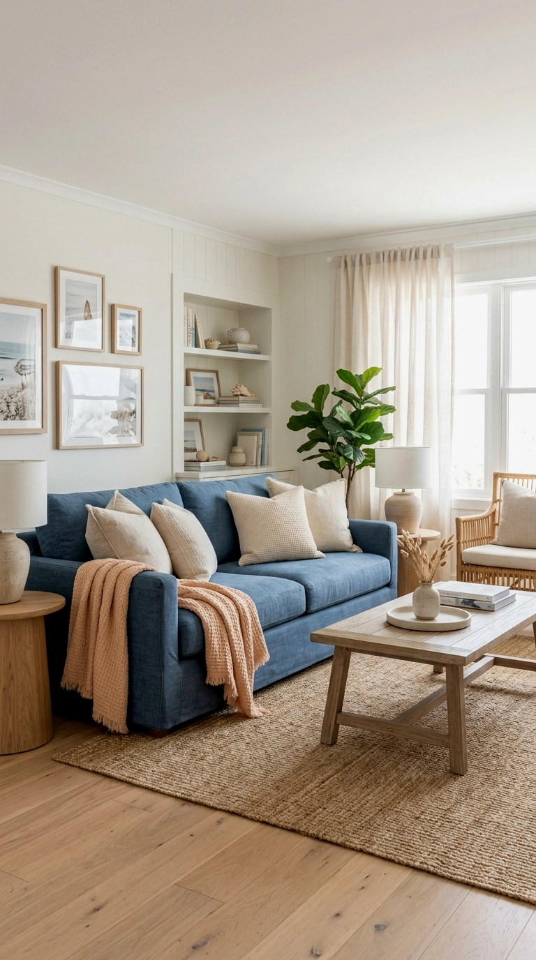
A sofa in washed denim blue is one of the friendliest pieces you can own, because it behaves like a favourite pair of jeans and goes with almost everything already in the room. Cream cushions soften its edges, and a peach throw or two adds the sunset note that stops the scheme from drifting cold, the same easygoing base you will see all through these blue couch living rooms, where the sofa does the colour work and everything around it stays gentle. This is a forgiving arrangement for busy homes, since denim tones shrug off the everyday marks of life.
Choose denim blue when you want colour that feels lived in from day one.
4. Pale blue cabinets or shelving with coral objects
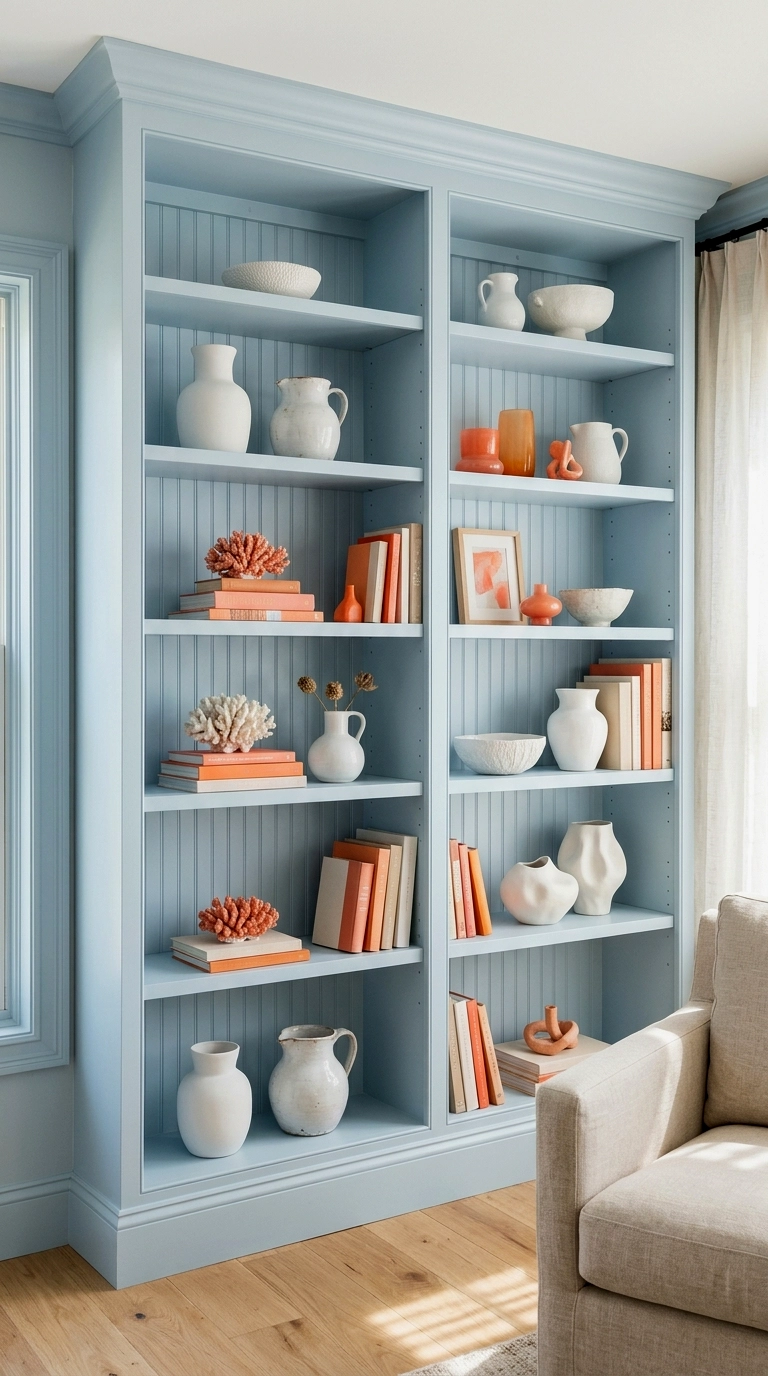
Painting built in shelving a pale, watery blue moves the colour into the bones of the room, so the furniture itself can stay calm and neutral. Style the shelves slowly, mostly white ceramics and clear glass, then place just two or three coral pieces where the eye naturally rests. The coral reads almost like found beach glass or a piece of washed up pottery, there and gone. Because the blue is permanent and the objects are not, you can retune the balance any season.
Let the joinery carry the colour and the styling stays easy forever.
5. Sky blue curtains with white sheers and a rust cushion pair

Hang sky blue curtains over plain white sheers and the daylight entering the room picks up the faintest tint of sea, softening everything it lands on. The sheers keep the light kind and private, while the blue frames the view like a horizon line. Down on the sofa, a pair of rust cushions answers the coolness with a small, steady warmth, nothing more than the room needs. It is a conversation between the windows and the seat, and it never gets loud.
Curtains and cushions can carry a whole calm scheme between them.
6. Blue and white pottery collection with orange flowers
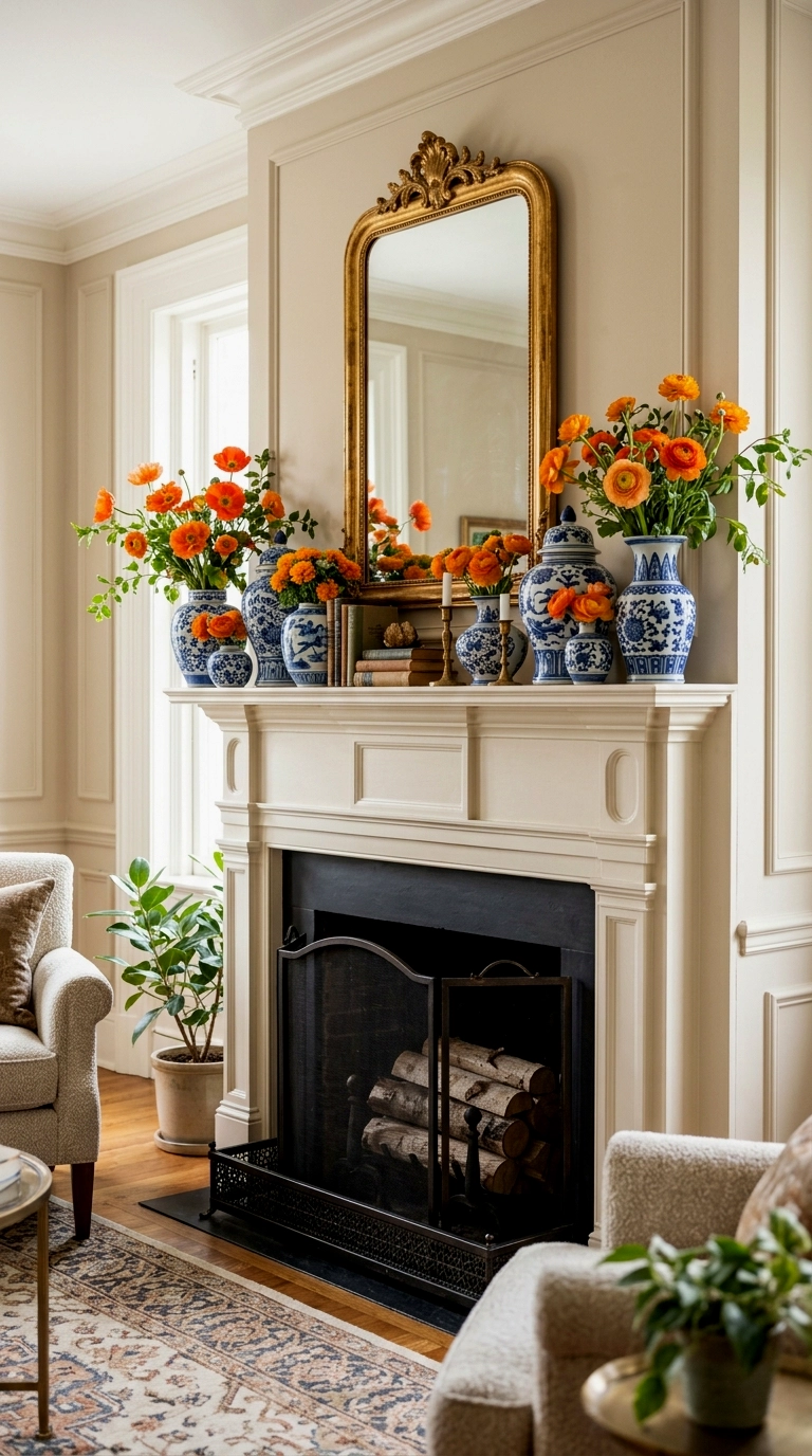
A mantel or shelf of blue and white pottery, ginger jars, small vases, a plate or two, has that collected over summers feeling that calm rooms do so well. The blue and white does the lasting work, calm and classic, and then the orange arrives the temporary way, as flowers. Marigolds, nasturtiums or simple orange roses in one of the vases warm the whole arrangement for a week at a time. When the flowers fade, the palette rests again without looking unfinished.
Let flowers carry the orange and the room never has to overcommit.
7. Washed blue armchairs with a natural jute rug and orange book stack

Two armchairs in a sun faded blue, set on a natural jute rug, give a room the settled feeling of a porch that has hosted a thousand slow afternoons. Jute is the great softener of this palette, because its warm, sandy texture sits comfortably under any blue and keeps contrast from ever feeling sharp. Orange, here, is barely present at all, a small stack of books with warm spines and perhaps a bowl on the side table. The effect is a room that hums rather than sings.
Natural fibre is the peacemaker that lets opposites share a room peacefully.
8. Pale blue and white checkerboard or tile pattern accents

Pattern, kept pale, is one of the gentlest ways to deepen this mood. A tiled fireplace surround in washed blue and white, or a checked throw folded over the sofa arm, adds rhythm and interest without adding volume. Because the colours are so soft, the pattern reads as texture more than decoration, and the room stays restful. Orange, in this version, is allowed exactly one small solid note, a stool, a single cushion, a ceramic lamp base.
Pale pattern whispers, so let one small orange piece be the only clear voice.
9. Coastal art: seascapes with one warm horizon

A seascape above the sofa, all blues and greys and shifting water, can hold the entire orange allowance of a calm room inside a single painted band, a sunset line, a strip of warm sand, the rust red hull of a small boat. Hanging the warmth inside the artwork keeps the furniture palette serene and gives guests something to drift toward. It also means the room’s one warm note is framed and intentional, like a window onto evening. Choose a frame in pale wood to keep the whole piece breathing.
Art can hold the orange beautifully, so the furniture never has to.
Bold Retro: Navy, Cobalt, True Orange
No easing in here. This mood walks in wearing navy and lights the room with true orange. Short on apology. Big on confidence. The blues go deep, the orange goes honest, and every piece earns its place or leaves. Walnut, brass and cream keep the whole thing tailored, like a well cut suit with a loud tie. If you want a room that starts conversations before you say a word, this is your section.
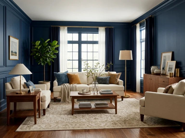
10. Navy walls with an orange sofa
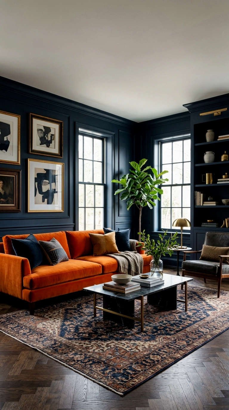
Navy walls first. No hesitation. Then the orange sofa lands against them like a struck match. It glows. It owns the room in about four seconds. Everything else steps back on purpose: cream rug, walnut wood, a little brass, nothing competing. Keep the orange to the sofa alone so it reads as a decision, not an accident.
Navy is the stage and orange is the headliner, never swap their jobs.
11. Cobalt blue sofa with orange and white graphic cushions
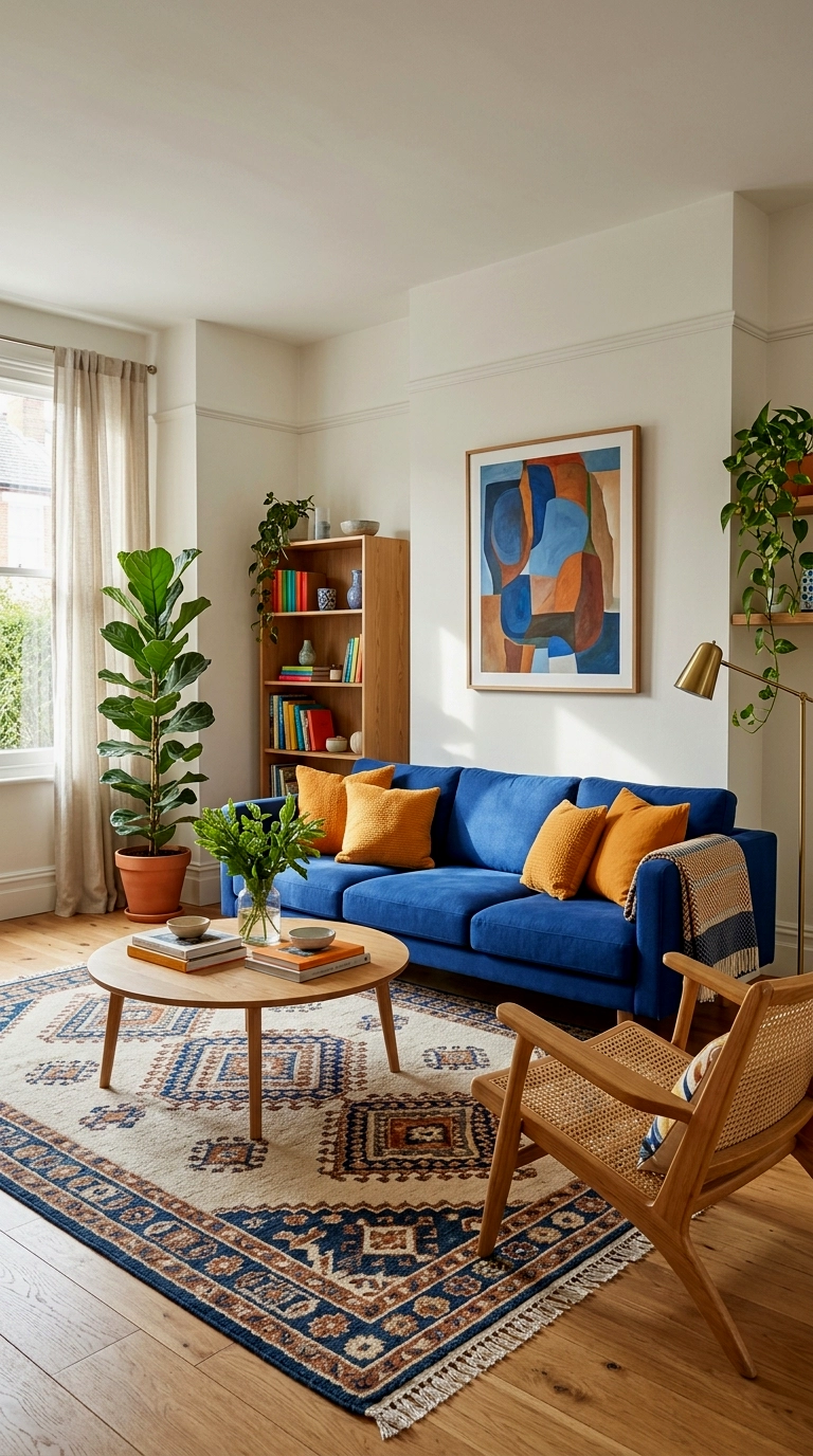
Cobalt does not do subtle. Good. Put it on the sofa and let it run the room. Graphic cushions in orange and white sharpen the whole seat, bold shapes, clean edges, mid century energy. Walnut furniture grounds it. An arc lamp or a starburst detail finishes the era’s handwriting. Nothing here is accidental and nothing is apologising.
Bold rooms need walnut nearby, it is the neutral that keeps saturation classy.
12. Orange armchairs pair flanking a blue rug

Two orange armchairs. A pair, always a pair. They land on a deep blue rug that anchors them like a pool of midnight. White walls referee from the sidelines and keep the contrast crisp. A single orange chair looks like a mistake. Two look like a manifesto. Add a walnut side table between them and the composition snaps shut.
Bold colour in pairs reads as intent, bold colour alone reads as error.
13. Blue and orange colour blocked wall or bookcase backs

Paint the bookcase backs navy. Leave the walls warm white. Now style the shelves with orange books, boxes and ceramics. The blue goes deep in the recesses. The orange pops forward off it. Best part: it is colour blocking with an off switch, repaint one afternoon and the room resets. Renters, take note.
Shelf backs are the boldest colour move you can undo in a weekend.
14. Retro patterned rug in navy, orange and cream

Let the rug carry both fighters. A mid century pattern in navy, orange and cream puts the whole palette on the floor in one confident gesture. Then the furniture can cool down: cream sofa, one blue chair, one orange cushion, done. The pattern does the arguing so the upholstery does not have to. Keep the rug big, small rugs make bold patterns look nervous.
When the rug holds both colours, everything above it can relax.
15. Orange lacquer or painted sideboard under blue art
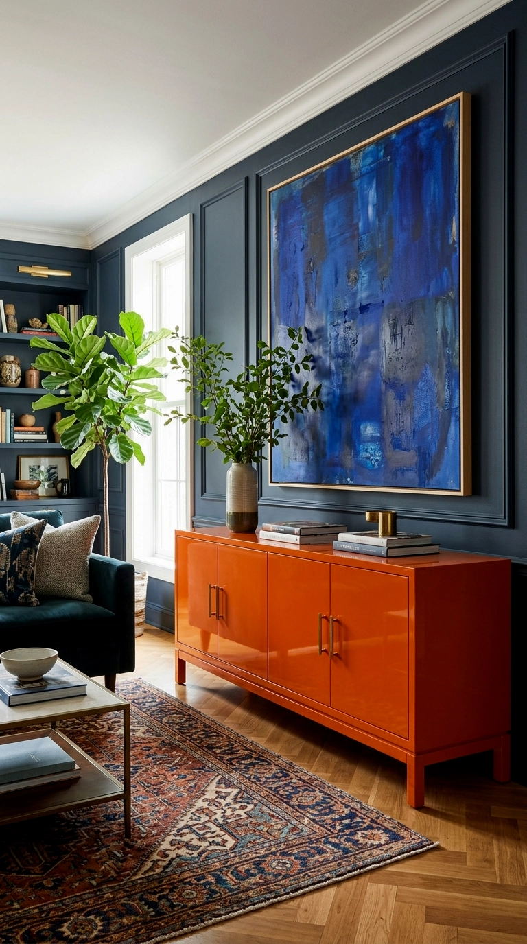
An orange sideboard in gloss lacquer is pure showmanship. It reflects light. It reflects confidence. Hang large blue artwork above it to balance the weight and give the eye its counterpunch. The shine is the point, so keep every other finish matte and let this one piece perform. One star per stage.
Gloss belongs in bold rooms, but only ever in a solo performance.
16. Navy curtains with orange tiebacks and cushions
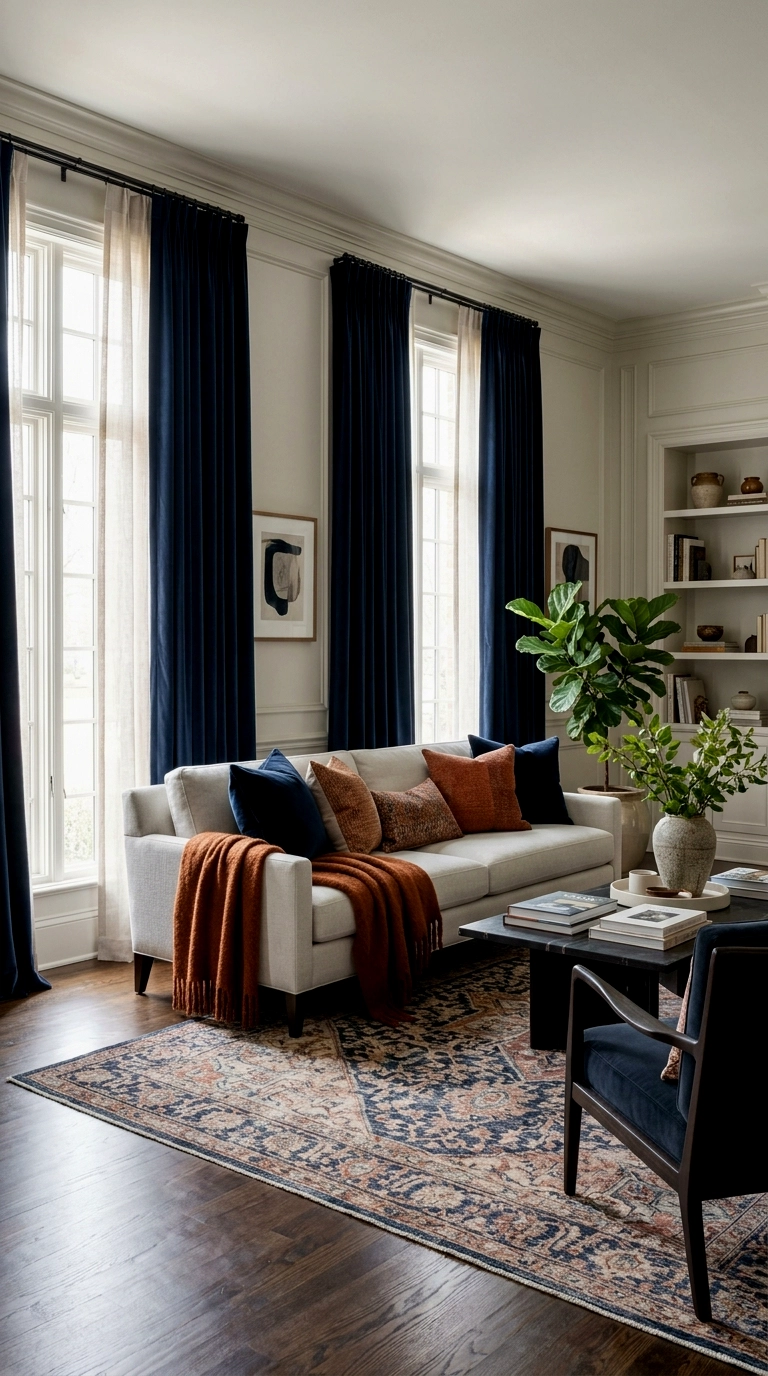
Heavy navy curtains bring the tailoring. They fall in deep folds and frame the windows like a theatre. Orange shows up in the details: the tiebacks, two cushions, a throw with intent. The ratio is what keeps it sharp instead of themed. Blue does the structure. Orange does the spark. Tailored rooms are just bold rooms with good manners.
Heavy blue, light orange, that ratio is the bold mood’s dress code.
17. Blue velvet chair with an orange lamp shade
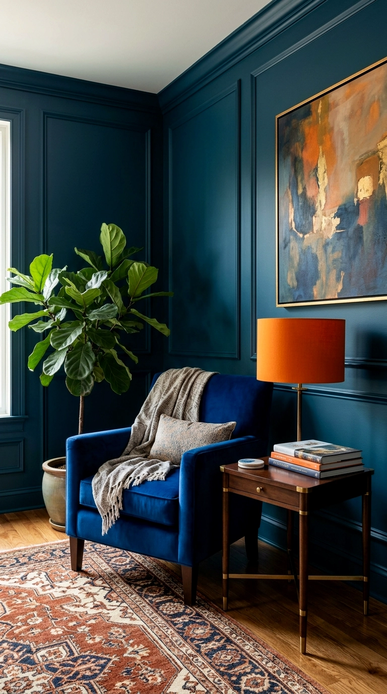
One cobalt velvet chair. One lamp beside it wearing an orange shade. That corner just became the whole room. The velvet drinks the light, the shade throws it back warm, and the pairing does the work of an entire decorating scheme. Small footprint. Enormous nerve. Corners like this are why guests remember a house.
Match one blue piece to one orange light and the corner steals the show.
Earthy Modern: Warm Neutrals, Clay Orange, Deep Blues
The earthy mood takes the same two colours and puts them through weather. Orange becomes clay, rust and terracotta, dug out of the ground rather than mixed in a factory, and blue deepens into indigo, petrol and slate. The base is warm neutral, bone white walls, pale oak, undyed wool, so the room feels gathered rather than decorated. Nothing here is shiny or sharp. It is the palette for people who want colour with dirt under its nails, in the best possible way.
18. Warm white walls, clay orange sofa cushions, indigo throws

Start with walls the colour of warm bone, not stark white, and a sofa in a natural, sandy tone, then lay clay orange cushions along it in twos and threes. Indigo throws, folded over the arms, bring the blue in at textile depth, the way old workwear fades to exactly this shade. (Think raw linen, unglazed clay, oiled wood.) The whole arrangement feels less styled than settled, like a room that has been arriving at this point for years.
Earthy rooms are built from sun faded versions of bold colours.
19. Terracotta pots and plants against a deep blue wall

One wall in a deep, inky blue gives terracotta something to glow against, and a row of clay pots along a bench or the floor turns that wall into a garden edge. Fill the pots generously, olive, fig, trailing herbs, so the green softens the meeting of earth and blue. (Think raw linen, unglazed clay, oiled wood.) There is a reason this pairing feels ancient: potters and dyers have set clay against indigo for thousands of years.
Clay and indigo never clash, they are the oldest neighbours in colour.
20. Blue patterned tiles or a tiled coffee table with rust textiles

Patterned blue tiles bring architecture to the palette, whether they surface a hearth, tile the top of a coffee table or line a tray on the ottoman. Their glaze catches light unevenly, which keeps the blue alive instead of flat. Around them, rust and ochre textiles do the warming: cushions, a woven throw, a runner under a bowl of oranges. (Think raw linen, unglazed clay, oiled wood.) Because tile feels permanent, the blue reads as part of the house itself.
Use tiles where you want the blue to feel built in, not applied.
21. Ochre and rust cushions on a slate blue sofa
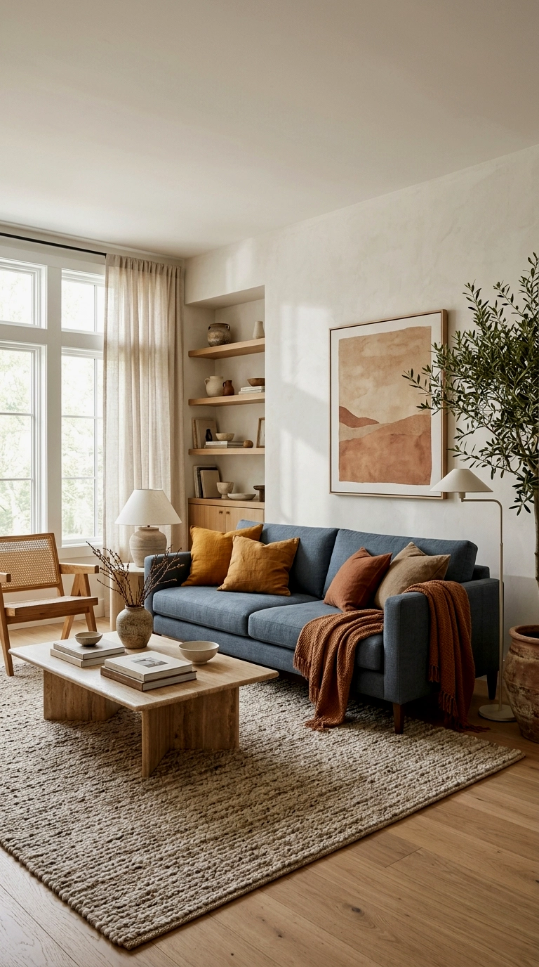
A slate blue sofa, blue with a little grey weather in it, is the earthy mood’s easiest anchor, because it takes the autumn oranges without any of the shouting of the bold palette. Dress it with cushions in ochre, rust and a faded brick, mixing linen and woven cotton so the colours land softly. (Think raw linen, unglazed clay, oiled wood.) The result suits slow evenings and everyday mess equally, which is rather the point of this mood. Nothing here needs protecting from real life.
Slate and rust is the palette in its everyday clothes, and it wears well.
22. Deep blue rug with a burnt orange border or pattern
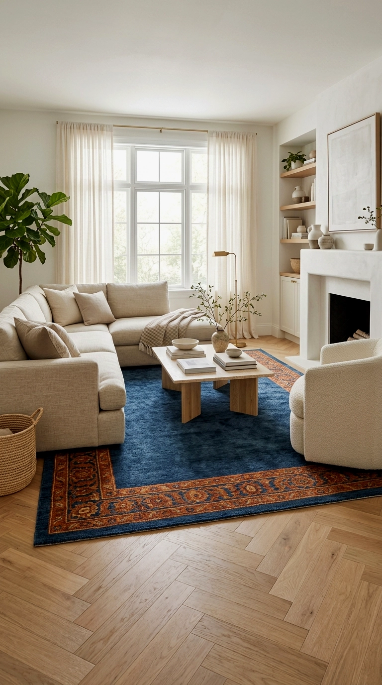
A deep blue rug with a burnt orange border lays the entire scheme on the floor in one move, so the furniture above it can stay warm and neutral: natural sofa, pale wood, undyed wool. Guests read the room from the ground up, and the border acts like the frame on a picture, making the blue field feel intentional and calm. (Think raw linen, unglazed clay, oiled wood.) Choose a flatweave or a worn vintage style piece to keep the mood grounded.
A two colour rug is a whole scheme you can roll up and take with you.
23. Wood heavy room: blue upholstery, orange leather accents

Let wood do the heavy lifting here, walnut and oak in the big pieces, their grain supplying the warmth and texture the walls are not asked for. Blue upholstery on the seating settles into that wood like water into a riverbed, and then orange arrives in its most grown up form: worn leather. A leather pouf, a pair of leather cushions, a chair softened by years. (Think raw linen, unglazed clay, oiled wood.) Leather orange ages into the wood family instead of fighting it.
Orange in leather is orange with a past, and it never looks loud.
24. Blue and rust gallery wall with wood frames

A gallery wall in warm wood frames can carry this whole palette above a neutral sofa, indigo prints, a piece of woven textile, rust and denim tones in the artwork. Because the frames share one warm material, pieces from anywhere, markets, travels, family drawers, hang together like a collection instead of a collage. (Think raw linen, unglazed clay, oiled wood.) This is also the most changeable version of the scheme, and swapping one print quietly retunes the room; it pairs naturally with the fully painted versions in blue wall living rooms if you ever want the colour to climb off the frames and onto the plaster.
A gallery wall is the palette at its most flexible, one swap shifts the mood.
25. Evening version: navy lamps glow, orange candlelight accents

When the light goes, the earthy room changes shift. Navy lamp bases with warm shades take over the blue, glowing deep and low, while the orange hands its duties to candlelight, amber glass and the rust textiles that were there all along. Plan this on purpose, because the evening version is the one you actually live in most, curled up after dinner with the lamps doing the decorating. (Think raw linen, unglazed clay, oiled wood.) Leave one candle cluster where it catches the blue of a lampshade and the room finishes itself nightly.
Every palette has a night shift, and the earthy one is the cosiest of all.
Shade Pairings at a Glance
| Blue | Pairs with | Mood |
|---|---|---|
| Pale blue | Apricot and peach | Calm Coastal |
| Denim blue | Rust and cream | Calm Coastal |
| Cobalt | True orange and white | Bold Retro |
| Navy | Burnt orange and brass | Bold Retro |
| Indigo | Clay and terracotta | Earthy Modern |
| Slate blue | Ochre and caramel | Earthy Modern |
So here is the test that settles it. Picture the room at 7pm on a wet Tuesday, rain at the windows, nobody coming over, just you and a lamp and something warm to drink. Whichever mood you would want to walk into then, pale and quiet, navy and electric, or clay and lamplight, is the one to build, because that unglamorous Tuesday is the room you truly live in, and the colours have to earn their keep there.