
25 Blue Wall Living Room Ideas, From One Wall to Four
Blue on a wall is a dial, not a switch. Turn it a little and you have one accent wall behind the sofa, a weekend’s work with a completely different feel by Sunday night. Turn it further and two walls wrap a corner into a reading nook. Turn it all the way and the whole room, ceiling included, becomes the colour, which is glorious in the right light and a mistake in the wrong one. These 25 ideas are arranged by exactly that dial, in four bands of growing coverage, so you can find the setting your room’s daylight can honestly handle and stop there, or push one band further on purpose.
Light Direction First
The light direction fact: a north facing room receives cool, blue grey daylight all day, so blues there need warmth built in, teal, petrol and blue greens, or the walls will read icy by afternoon. A south facing room is bathed in warm light for most of the day and can take pure blues, even icy ones, without ever feeling cold. An east facing room glows warm in the morning and cools off by evening, while a west facing room does the reverse, grey at breakfast and golden by dinner. Judge every sample at the hour you actually sit in the room, because that light, not the shop’s light, is the one your blue has to live in.
One Wall: The Accent
One wall is where almost everyone should start: a single surface, usually the one behind the sofa, carrying the whole colour while the rest of the room stays exactly as it is. It is enough blue to change the room’s mood and little enough that a change of heart costs one tin of paint. Commitment: one tin of paint, a Saturday morning, and an undo that takes a single coat of primer and an afternoon.
1. Navy accent wall behind a cream sofa

This is the starter move of the whole blue palette and it earns the title: one deep navy wall, a cream or oatmeal sofa set against it, and brass lamps on either side to keep the dark warm. The sofa wall takes blue better than any other because the wall frames the seat the way a headboard frames a bed, making the arrangement look deliberate from every angle. If you are choosing your first wall, choose this one, and sample the navy at its deepest, since a single wall can carry more saturation than four. It is the mirror image of the trick used in the blue couch living rooms, where the sofa brings the blue and the walls stay pale; here the wall brings it and the sofa stays cream.
One navy wall plus a cream sofa is the safest dramatic move in decorating.
2. Pale blue accent wall with white furniture and natural wood
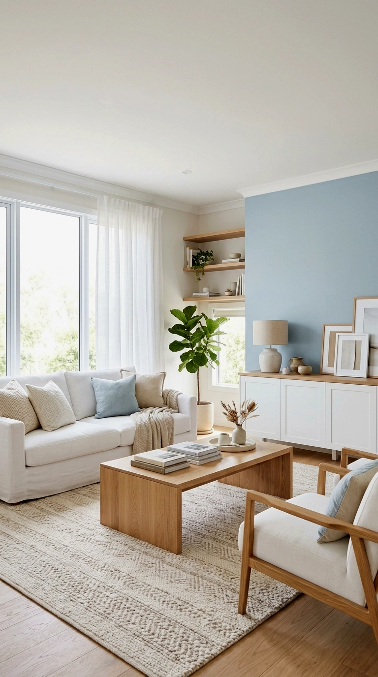
A mist or powder blue on one wall reads like sky let indoors, and it is the accent to pick when the room cannot afford to lose any light. White furniture keeps the daytime brightness intact, while natural wood in the table, the floor or a shelf stops the pale blue turning chilly. The effect is gentle enough for north facing rooms that would shiver under navy. Leave the other walls warm white rather than brilliant white, and the blue will feel like weather, not paint.
Pale blue is the accent wall for rooms that live on borrowed light.
3. Teal accent wall behind the television
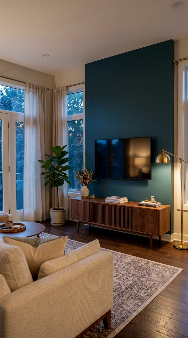
Teal is the accent wall for rooms that mostly live at night, because it flatters a screen the way a cinema flatters a film: the picture looks richer, and the black frame of the television all but disappears into the colour. Put warm wood under it, a walnut or oak media unit, because teal on its own can drift cold once the lamps come on. Cushions in rust or ochre on the sofa opposite will finish the warmth. If your living room is really a viewing room, this is your wall.
Teal behind the television makes the screen look better and the room feel later.
4. Blue accent wall with a gallery of warm framed art

Cover a generous half of a blue accent wall with art in wood and gold frames, landscapes, portraits, prints with warm grounds, and the wall stops being a statement and becomes a backdrop, which is an easier thing to live with. The blue showing between the frames reads as depth, and every picture looks more expensive against it. This is also the version for the nervous: hang more art and the commitment shrinks, take art away and the drama returns. Start with the biggest frame you own at the centre and build outwards.
A gallery wall lets you tune the blue up or down without touching a brush.
5. Blue board and batten or panelled accent wall

Panelling in the same blue doubles the effect without deepening the colour, because the mouldings catch light and shadow all day and give a flat mid blue the tailored richness of a much darker shade. Board and batten, picture frame moulding or proper tongue and groove all work, and all of them suit a sofa wall or the wall behind a sideboard. Choose the paint one notch lighter than your instinct says, since the texture will enrich it for free. It is the accent wall that looks like joinery money was spent.
Panelled blue reads one shade richer than it is, so buy a shade lighter.
6. Blue accent wall in an open plan room to zone the living area
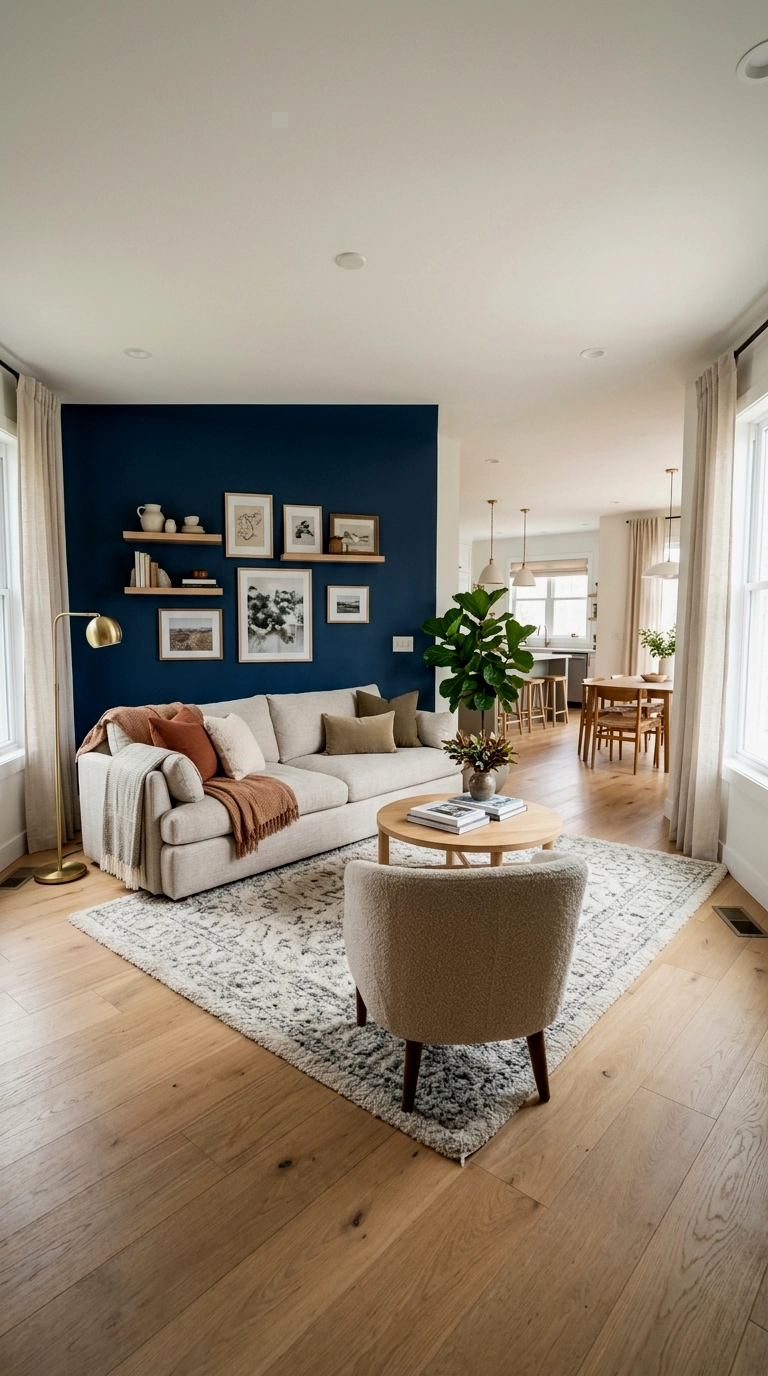
In an open plan space, an accent wall stops being decoration and starts being architecture: blue painted behind the sofa declares exactly where the living area begins, while the kitchen and dining zones stay neutral behind you. The trick works even better with a rug under the seating in a related tone, wall and floor agreeing on the boundary. Keep the blue’s edge crisp at a corner or a doorway if the layout offers one, since a colour that ends mid wall looks like it ran out.
In open plan rooms, one blue wall is a partition you can repaint.
7. Two tone accent: blue below the rail, white above
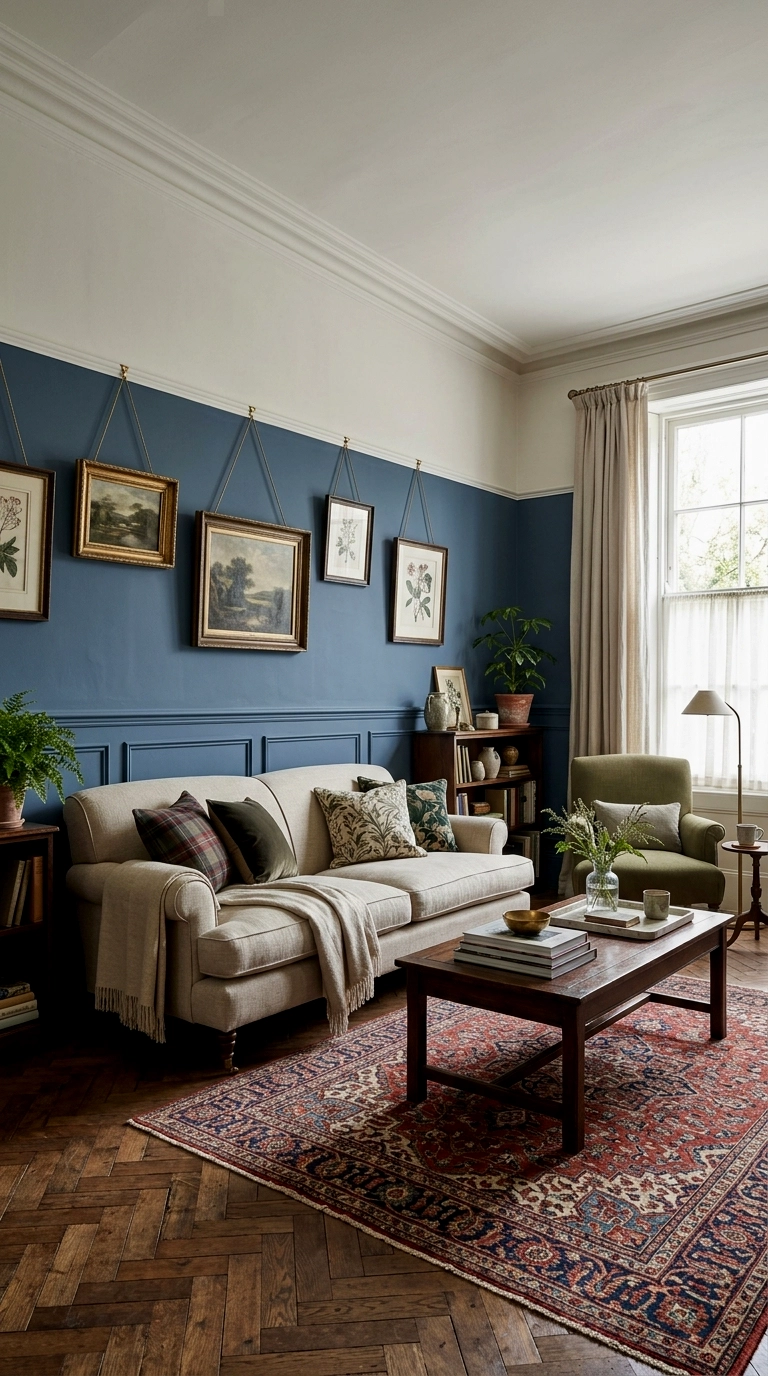
Blue up to picture rail or dado height with warm white above is the accent wall for period rooms and the commitment shy alike: the ceiling stays high and bright, the colour stays grounded where the furniture is, and the line between them adds architecture the room may not have. It is, in effect, one wall wearing the dial at half setting. This is also the friendliest version for the blue curious, since a half wall of colour changes a room’s character without changing its light.
Half height blue gives you the mood and keeps the daylight.
Two Walls: The Corner Wrap
Two walls is the dial’s most underrated setting, because wrapping a corner builds a place, not just a backdrop: a reading nook, a fireplace portrait, a corridor of colour in a long room. The rest of the space stays light, so the blue reads as a destination inside the room rather than the room itself. Commitment: two tins of paint and most of a weekend, with an undo that runs to a full day of priming and repainting.
8. Blue on two adjoining walls wrapping a reading corner
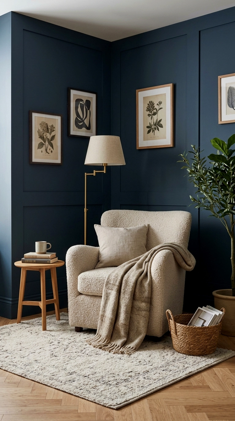
Paint two adjoining walls and you have built a room inside the room: a corner wrapped in blue, holding a reading chair, a lamp and a small shelf, while the rest of the living room stays pale and sociable behind it. The wrap works because corners are where eyes rest, so the colour settles exactly where someone settles too. Choose the corner that already gets the chair, near a window if possible, and let the blue make it official. Add a cushion and a throw inside the wrap and it becomes the seat everyone quietly competes for.
A blue corner is the cheapest extra room you will ever build.
9. Blue walls either side of the fireplace
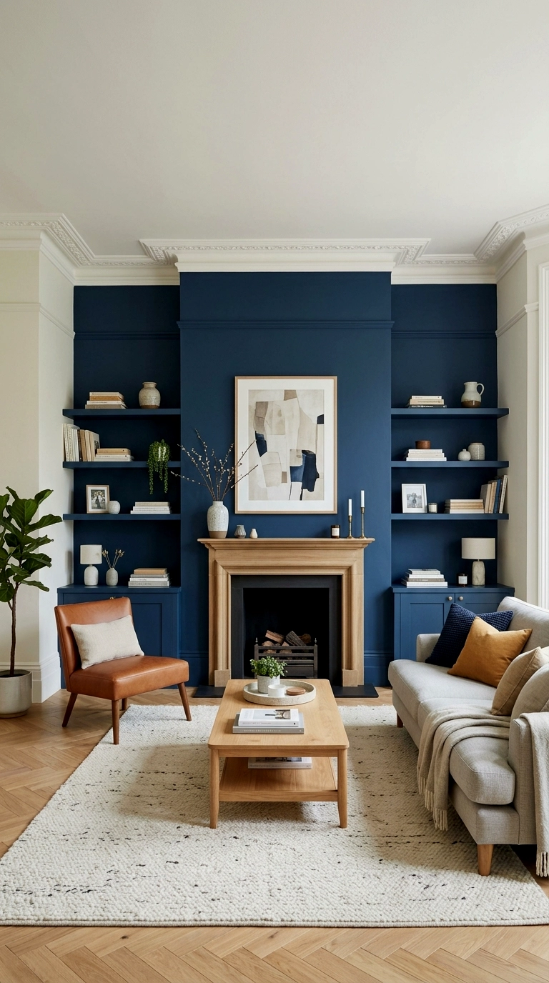
Painting the chimney breast and its two alcoves turns the fire wall into the room’s portrait, framed by paler walls on either side. Something generous happens at night: firelight against blue reads twice as golden as firelight against white, so the whole arrangement flatters the one feature every living room gathers around. Style the alcoves with books, logs and brass, and keep the mantel simple so the colour does the framing. If your room has a fireplace, this is the two wall version to beat.
Blue around a fireplace is a frame the fire has been waiting for.
10. Blue window wall and sofa wall, white between

Two facing walls in blue, the window wall at one end and the sofa wall at the other, with white side walls between them, builds a corridor of colour that gives long, purposeless rooms a shape. The blue at the window end deepens the daylight’s frame, and the blue behind the sofa answers it, so the room feels held at both ends. Long rooms are the ones that need this most, since their ends usually drift. Keep the furniture pale and low so the corridor stays a feeling, not a tunnel.
Facing blue walls shorten a long room in the kindest way.
11. Blue lower walls all round, white above, the two wall illusion

Run one continuous blue band at sitting height around every wall, with warm white above it, and you get the confidence of a two wall room at a fraction of the commitment, plus a hidden practical gift: the blue sits exactly where scuffs, chair backs and small hands do their damage, and it hides all of it better than white ever will. A chair rail or simple batten along the top edge keeps the line tailored. Family rooms, this one is yours. It reads smart from the doorway and forgiving up close.
The blue band is tailored from across the room and practical within arm’s reach.
12. Blue walls with white wainscoting and trim below
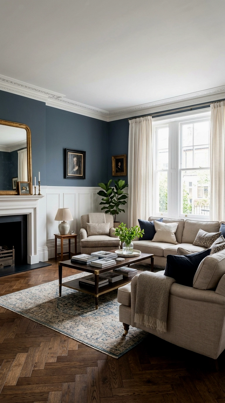
White panelling below and blue above is the classic two layer wall, and its logic is lighting as much as looks: the white does the bright work at floor level, bouncing daylight around the furniture, while the blue floats at picture level where it can be as moody as it likes. Wainscoting also protects the wall where chairs and hoovers bump it, which is why the arrangement survived a century of hallways and dining rooms. Paint the panelling in a satin finish so it wipes clean.
In this scheme the trim is not decoration, it is the lighting plan.
13. Blue on the media wall and bookcase wall, warm wood between

Give the blue to the two walls that already have jobs, the screen wall and the bookcase wall, and join them with warm wood furniture: a walnut unit here, an oak sideboard there. Because both blue walls are busy being useful, the colour never reads as a theme, and evenings in the room settle into a members club feeling, lamplight, books and a dark, calm surround. This is the two wall version for people who hate the idea of a feature wall. There is no feature here, just function wearing a good colour.
Blue on working walls feels like a library, not a statement.
Trim Pairings
| Wall blue | Trim pairing | Effect |
|---|---|---|
| Navy | Warm white or cream trim | Classic contrast, never stark |
| Mid blue | White or pale grey trim | Fresh, coastal leaning |
| Teal | Cream or natural wood | Warm and evening friendly |
| Pale blue | White trim, or one shade deeper blue | Soft, or tailored and tonal |
Four Walls: The Full Room
Four walls is immersion: the colour stops being something in the room and becomes the room, and atmosphere doubles while wriggle room halves. Full blue rewards smaller rooms, good lamps and pale furniture, and it punishes glare, clutter and cold light without mercy. Commitment: four tins of paint, a long weekend, and an undo that is a genuine project, primer plus two coats on every wall.
14. Full navy room with cream sofa and brass everywhere
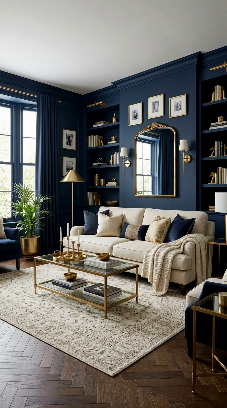
Watch out: full navy will shrink the room on paper, and in a large, high room it can feel more cavernous than cosy, so this band flatters smaller living rooms most. Done there, it is the complete immersion: navy on every wall, a cream sofa glowing in the middle of it, brass and warm wood repeated in every lamp, frame and handle until the dark reads as warmth. The decorating relatives of this room are the black living rooms that still feel warm, which run on the same rule, that a dark room is warmed by metal and wood, not rescued by paler paint. Keep the ceiling white and the rug pale, and the room will feel like evening in the best way.
15. Full mid blue room with white ceiling and pale floors
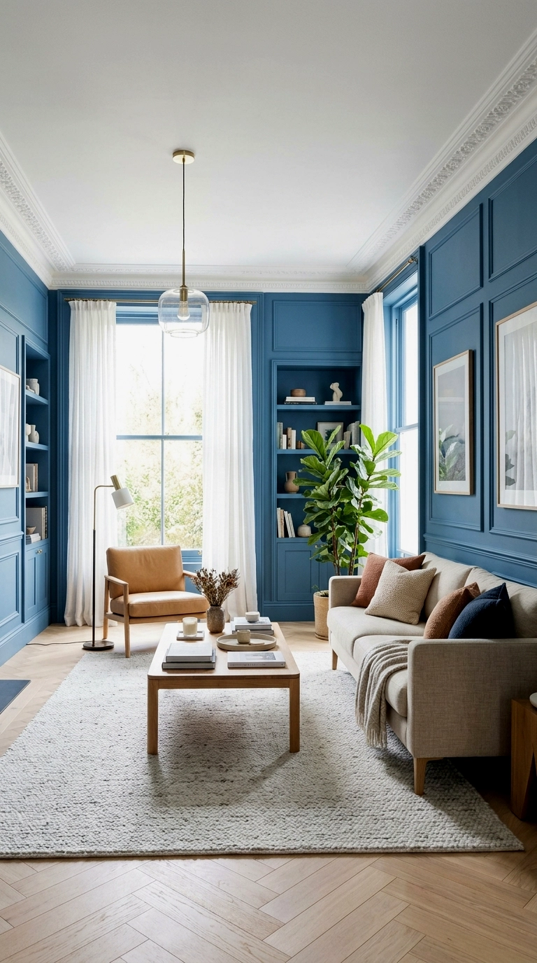
Watch out: a true mid blue, neither pale nor navy, is the easiest full room colour to get slightly wrong, because under warm evening bulbs it can slide toward green, so sample it big and live with the sample for two days. The structure that keeps it fresh is a sandwich: bright white ceiling above, pale floors below, and the mid blue held between them like a clear sky at midday. Furniture can stay light and simple, white, pale wood, natural linen, since the walls are doing all the colour work. Leave one finish matte and the room stays calm.
16. Full teal room with cognac leather and plants

Watch out: teal on four walls is a commitment to green’s company, because teal is a blue green and every plant, cushion and picture in the room will pull it one way or the other. Embrace it and the room becomes a greenhouse at dusk: cognac leather seating glowing against the teal, plants at every corner doing what they do best against a blue green ground. The leather matters, since its orange brown warmth is exactly what stops four teal walls turning swampy after dark. Add brass lamps, keep the ceiling white, and water everything.
17. Full blue room with patterned curtains and rug carrying the relief
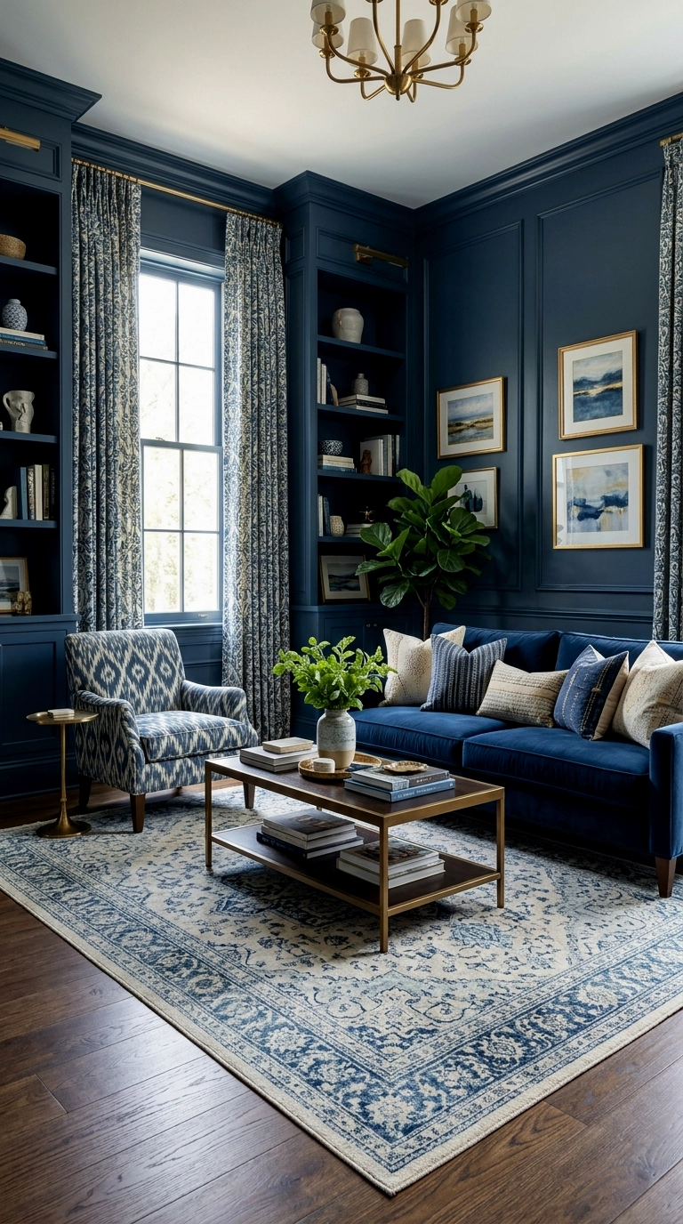
Watch out: when all four walls are one flat colour, a room furnished in all flat colours too will feel like the inside of a box, so pattern has to change address and move into the textiles. Patterned curtains at the windows, a patterned rug under the seating and cushions with print give the eye the variety the walls have given up, and the balance lands exactly right: calm at standing height, lively at sitting height. Choose one pattern scale large and one small so they do not argue. The walls, relieved of decorating duty, simply hold the room together.
18. Full dusty blue room with grey and silver calm
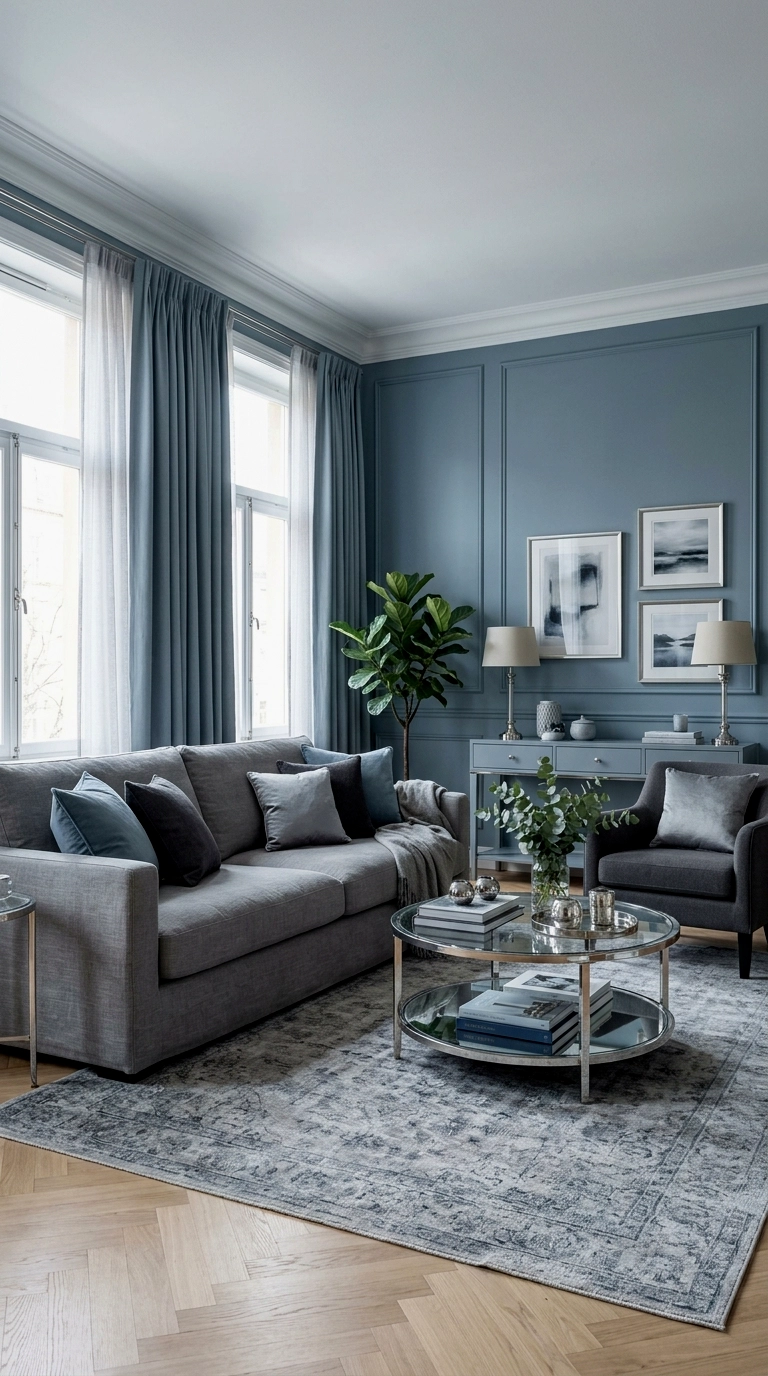
Watch out: dusty blue is navy with grey in it, and in a cool north light it can tip from serene to flat, so this is the full room to reserve for decent daylight. Where the light is kind, it is the quietest scheme in this whole article: dusty blue on all the walls, grey upholstery, silver and chrome in the small touches, a room built for reading, Sundays and low conversation. Nothing shines hard and nothing shouts, which is the luxury on offer here. Add one warm lamp and a wool throw so the calm stays human rather than hotel like.
19. Full blue room split by a white picture rail line

Watch out: tall rooms take full blue worst of all, because four uninterrupted coloured walls emphasise height until the room feels like a stairwell. The fix is a white picture rail line run around all four walls, blue below it and a softer blue or warm white above, which cuts the height kindly and adds the architecture newer rooms lack. The rail also hands you a hanging system for art that never needs a new hole. Below the line, furniture can be richer and darker, since the white above keeps the room breathing.
20. Full blue room with a statement ceiling kept white and beamed

Watch out: with blue on every wall, a plain flat ceiling can feel like a lid, and the room needs the ceiling to do some pattern work of its own. White beams or a coffered ceiling in white gives exactly that: the crown of the room stays bright and structured while the blue walls do the enclosing, an arrangement farmhouses and old cottages have used for centuries. Under beams, the blue can go a shade deeper than usual, because the white overhead buys back the light. Keep the beams’ white warm rather than brilliant so it sits happily against the blue.
The Fifth Wall: Ceiling Included
The fifth wall is the dial turned past its last notch: the ceiling joins the colour, and the room becomes a complete environment, jewel like, pool like, unforgettable when it works. It asks for pale furniture, good bones and total conviction, because a half hearted drench just looks like running out of white paint. Commitment: the most paint, the longest weekend, and the hardest undo of any band here, ceilings being nobody’s favourite repaint.
21. Blue ceiling with white walls, the sky reversed
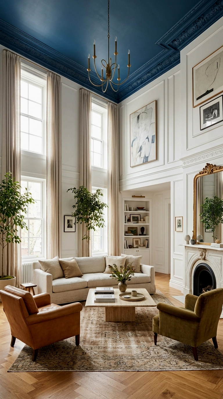
Watch out: a blue ceiling lowers a room visually, every time, so keep this for ceilings with height to spare or the space will feel pressed down by evening. In a tall room, though, a mid or deep blue ceiling over white walls inverts the safe scheme with real flair: the drama happens overhead, eye level stays bright, and nobody’s sofa clashes with anything. It is the one surface blue can cover completely with zero seating consequences, and at night, under lamplight, the ceiling reads as deep sky. Paint it matte, always, so it stays sky rather than lid.
22. Blue walls and ceiling, colour drenched, with pale furniture

Watch out: colour drenching fails the moment the furniture is not pale enough, because mid toned pieces against mid toned walls melt into a gloom where nothing can be seen properly. The rule that saves it: every large piece, sofa, rug, curtains, must be paler than the walls by a clear mile, cream, bone, pale wood, so the room reads as a deep blue setting for light furniture rather than a blue fog. Walls, ceiling and woodwork all take the one blue, skirting and doors included, which is what makes small rooms wear it as luxury instead of darkness.
23. Blue ceiling with blue accent wall, a continuous waterfall

Watch out: the waterfall only works if the ceiling colour and the wall colour are the exact same paint, mixed in the same batch if you can manage it, because a near match reads as a mistake at the corner where they meet. Get it right and ceiling plus one wall flow over the corner as a single gesture, behind the sofa or over a reading corner, architecture made of nothing but paint. It is the boldest cheap move in this article, since the materials cost one tin and the effect costs guests a double take. End the run cleanly at a corner, never mid wall.
24. Pale blue ceiling with deeper blue walls, gradient calm
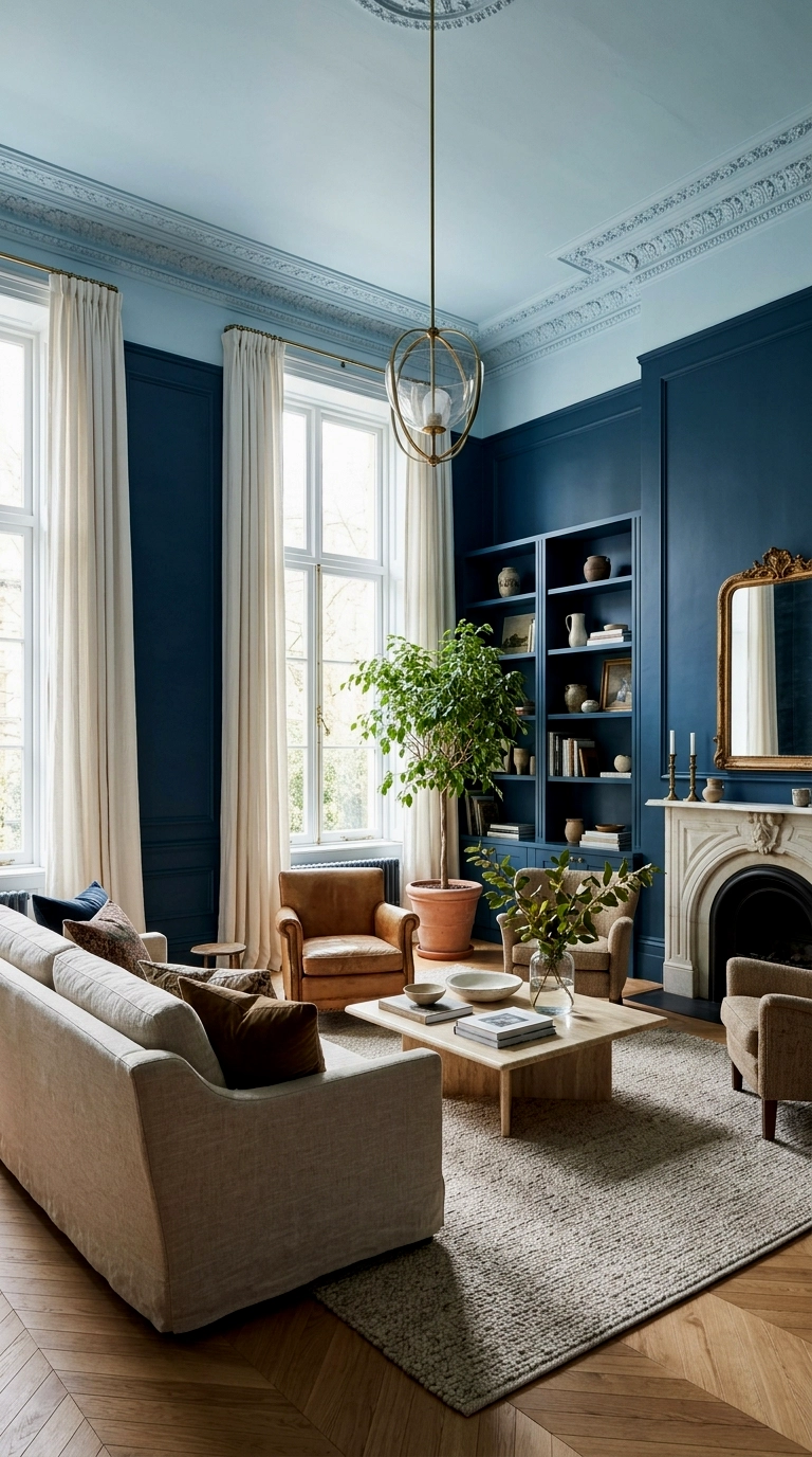
Watch out: the gradient reverses if your ceiling blue is too close to the wall blue, and the room just looks unevenly painted, so keep a clear two or three shade gap between them. Done properly, deeper walls under a paler ceiling borrow nature’s own arrangement, the sky lightening overhead, and rooms feel taller while evenings feel softer. This is the gentlest version of the fifth wall, the one to choose if drenching tempts you but full commitment does not. It also forgives imperfect ceilings, since pale matte blue hides a multitude of plaster sins.
25. Blue everything with warm white trim as the only relief
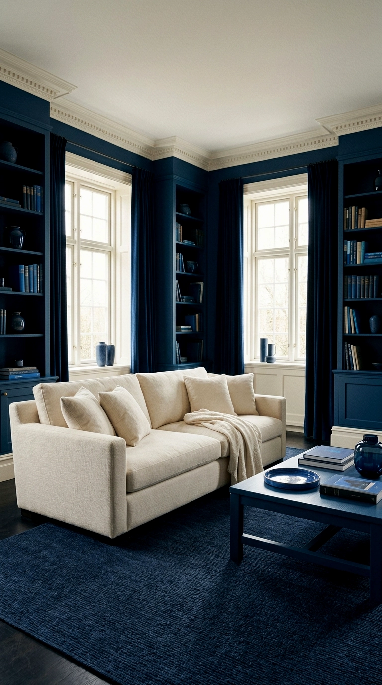
Watch out: this is the cover shot version and it is genuinely unforgiving, because with walls, ceiling and shelving all in blue, every object in the room is judged against it and anything muddy or yellowish will show itself instantly. The relief is rationed on purpose: warm white trim painted like jewellery, a cream sofa, art in wood and gilt frames, and nothing else pale gets in. In the right light it is the most memorable room in this entire article, the one guests describe to other people. Commit fully or choose an earlier band, because halfway here is nowhere.
One wall or five, remember what makes blue the friendliest strong colour to live with: the dial turns both ways. Paint is the only renovation that comes with an undo button, a coat of primer and a free weekend standing between any of these rooms and a fresh start. So start where your daylight lets you, sample bigger than feels sensible, and turn the dial with confidence, knowing nothing you do with a paintbrush this month is permanent.